How to design stickers: Making custom stickers, part 1
Posted by Sticker Mule on
Custom stickers are more than just fun, they’re powerful tools for branding, marketing, and even monetizing. Whether you're a small business looking to promote your brand or an artist trying to create some designs that sell, designing the perfect sticker requires more than just technical skill.
Thoughtful decisions during the design and sticker preparation stages are crucial to ensure your stickers not only look amazing but also resonate with your audience. You’ll probably make different design choices if the sticker is for your own rock band than when it’s for your niece’s 6th birthday party.
Understanding the nuances of sticker printing is key to creating professional-grade results. For example, choosing between die-cut stickers, with their custom-shaped designs, and kiss-cut stickers, which feature a flexible peel-off backing, can greatly influence both the look and functionality of your stickers.
In this guide, we'll walk you through the entire process from designing your sticker to preparing your files for production and choosing the right printing options. With these tips, you’ll be ready to create stickers that truly stand out.
Without further adieu, here's everything you need to know about designing your sticker from start to finish.
1. Brainstorming
Before jumping into the design process, take a moment to consider who your sticker is for and what message you want to convey. A great design isn’t just visually appealing—it resonates with your audience.
Who is your sticker for?
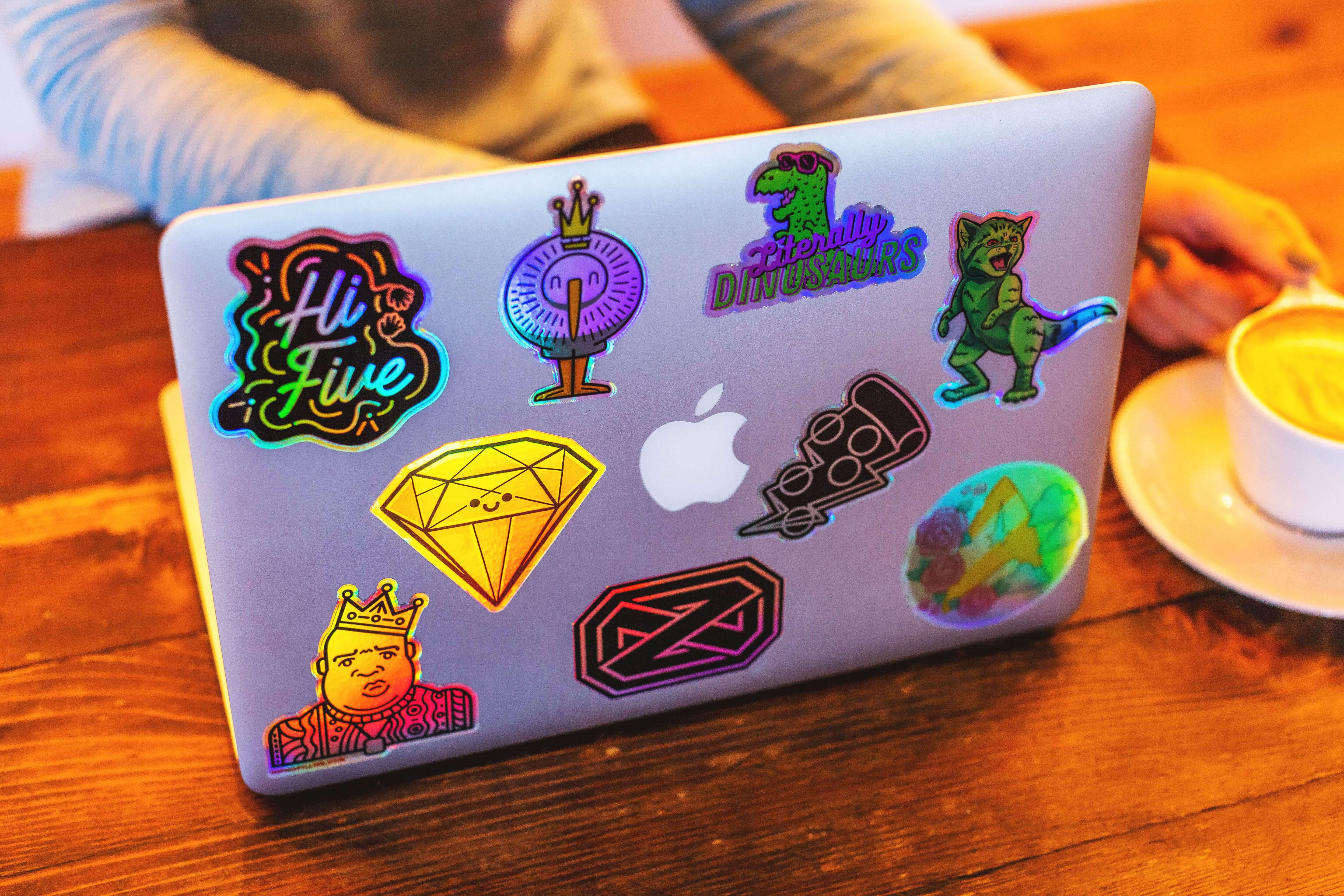
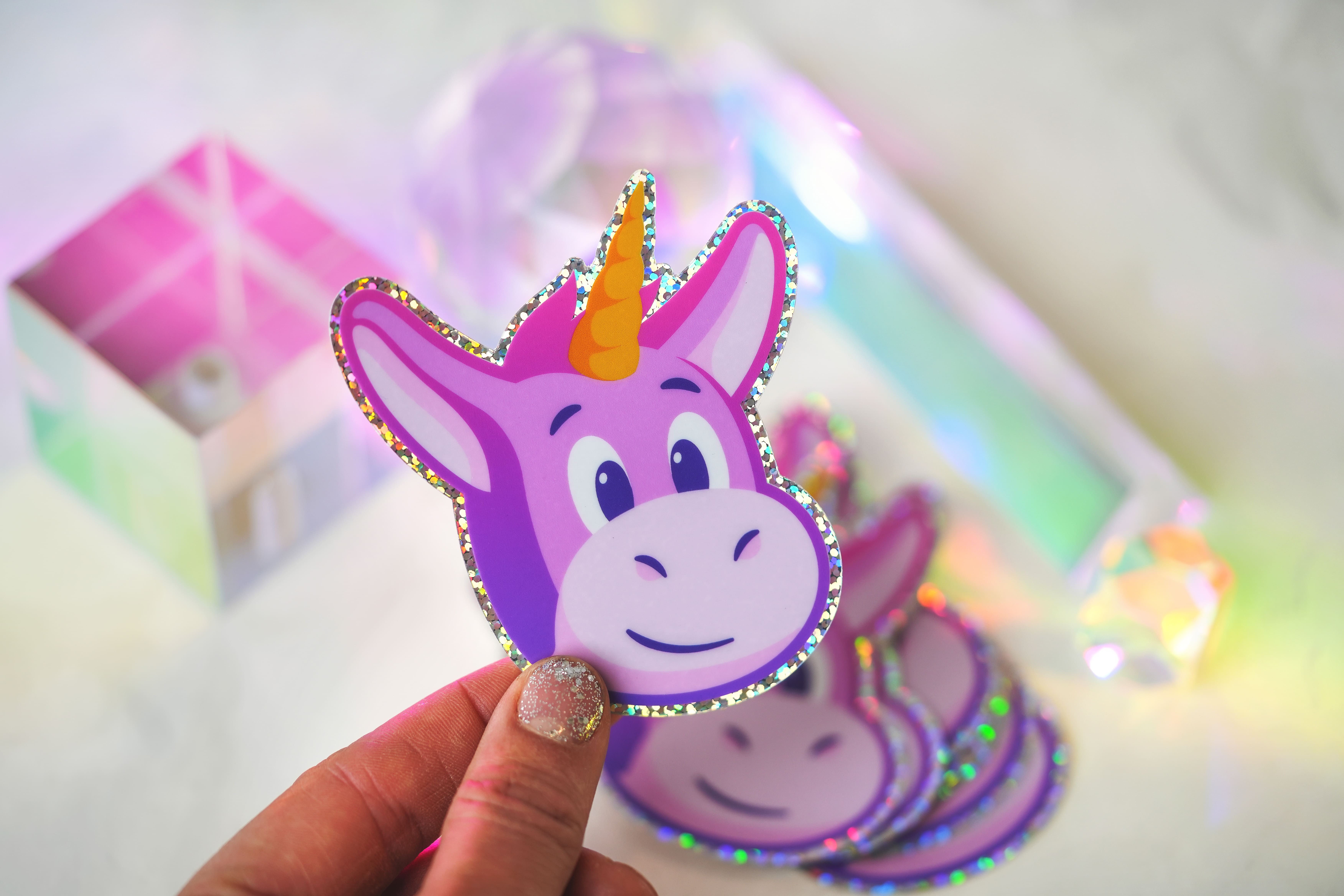
Popular stickers often tap into a shared interest, emotion, or trend. For example, fun, colorful stickers with cute characters might appeal to a younger audience, while sleek, minimalistic designs are a better fit for professionals who want to slap them on their laptops to show off in their favorite coffee place.
Understanding your target audience helps guide your design choices, resulting in a thoughtful, tailored design that resonates with those who receive it.
Finding inspiration
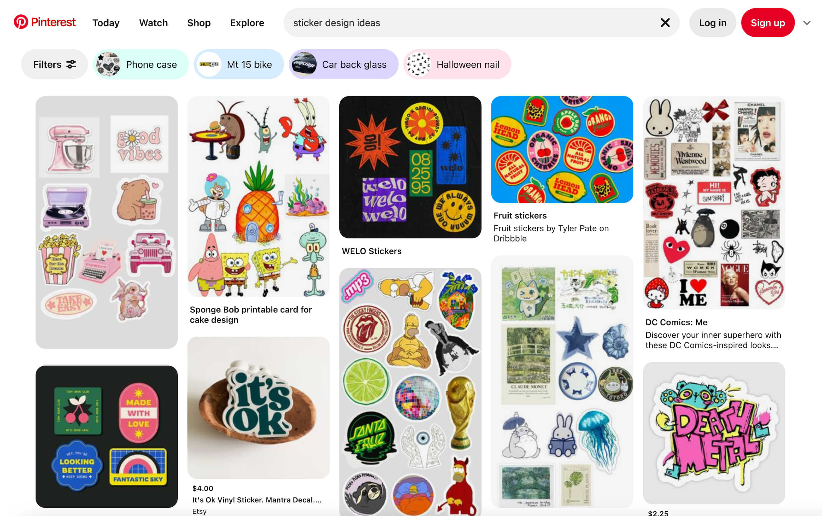
When brainstorming online, platforms like Pinterest and Instagram are excellent starting points. Explore trending designs and take note of what catches your eye.
Pinterest, in particular, makes it easy to discover styles you like and find related visuals based on specific aesthetics or keywords. Creating a board for each project is a great way to stay organized and keep your inspiration in one place.
It goes without saying to avoid copying others too literally. It's great to draw inspiration from different designs and to play with combinations of different concepts. But there's a line between being inspired by others' designs and stealing them. You don't want to have to face the wrath of the 6 year-old whose drawing of a unicorn you "borrowed"—and her team of intellectual property lawyers.
Jokes aside, copying isn't cool. Stay creative and authentic.
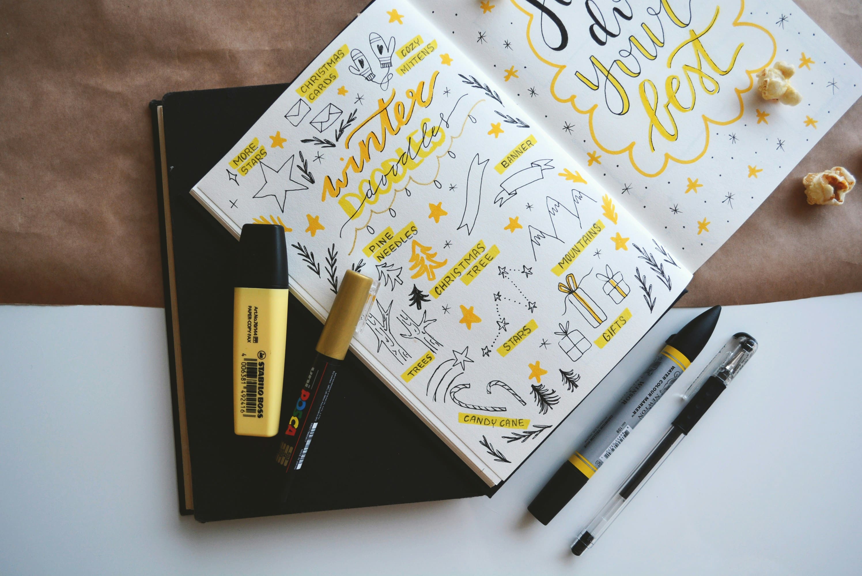
During this stage, don’t hesitate to jot down notes or sketch a few rough ideas. Having a visual reference can guide your design choices later. Once you’re "in the zone," ideas can come quickly, so capturing them ensures you don’t lose track of your creativity.
2. From idea to sketch
Now that you’ve got some more ideas flowing, it’s time to get them on paper (or screen) while you’re doing it.
While digital is ultimately where the magic happens when designing a sticker, I would personally advise starting with a piece of paper. Doodling a quick bit of something only takes a second and is so much more natural to do, enabling a tactile experience, unfiltered creativity, and the ability to focus and hone your skills without the limitations of technology.
Having everything next to each other also helps to make connections/crossovers, and most of the time, that’s where the most original ideas come from.
In a design process like this, there are essentially 2 different types of sketching:
Rough sketching
- This type of sketching is all about getting your ideas onto paper. It’ll likely be a mix of words and drawings, but the quality of the drawings doesn’t matter—what’s important is capturing your thoughts. After brainstorming and doodling a range of ideas, you’ll pick a few with enough potential to explore further. The length of this stage depends on how much time you want to invest.
- When that one winning idea emerges, it’s often so exciting that you can’t wait to develop it further. Those are the best moments as a designer. Aim to find that standout idea for each project—the one you can't wait to start with. However, it’s always a good idea to have a few extra sketches in reserve, so make sure to select a couple of backup ideas as well.
Refined sketching
- Once you’ve identified some promising ideas, it’s time to refine them further. Move beyond stick figures and quick scribbles to start defining the character you want to create and the typography you envision—unless, of course, stick figures and scribbled words are exactly the look you’re going for!
- At this stage, you can stick with paper or transition to a digital method that offers more flexibility. Many designers now use tools like an iPad with sketching software such as Procreate, which provides a natural drawing experience along with the perks of features like “Undo” and an eraser. Unfortunately, real life still doesn’t come with an “Undo” button (Elon Musk has entered the chat).
3. From sketch to screen
Once your sketch is ready and you have a clear idea of what it should look like in the end, it's time to bring it to the screen. When you’re designing something that needs to be printed at some point, you’ll need to have an understanding of some of the basics to get the maximum result and set up your file correctly from the start.
Raster vs. vector
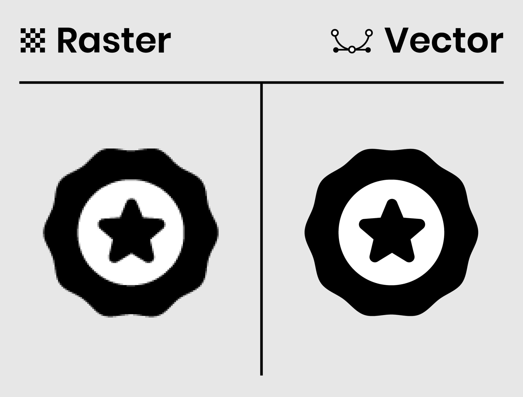
For the best print quality, it’s important to work with vector graphics. Vector files like AI and EPS, are scalable without losing their resolution, making them perfect for sticker printing. Raster images (like PNG and JPEG) can pixelate when resized, so they’re best avoided, especially for large stickers.
We’ve explained the difference between raster images and vectors in a previous article.
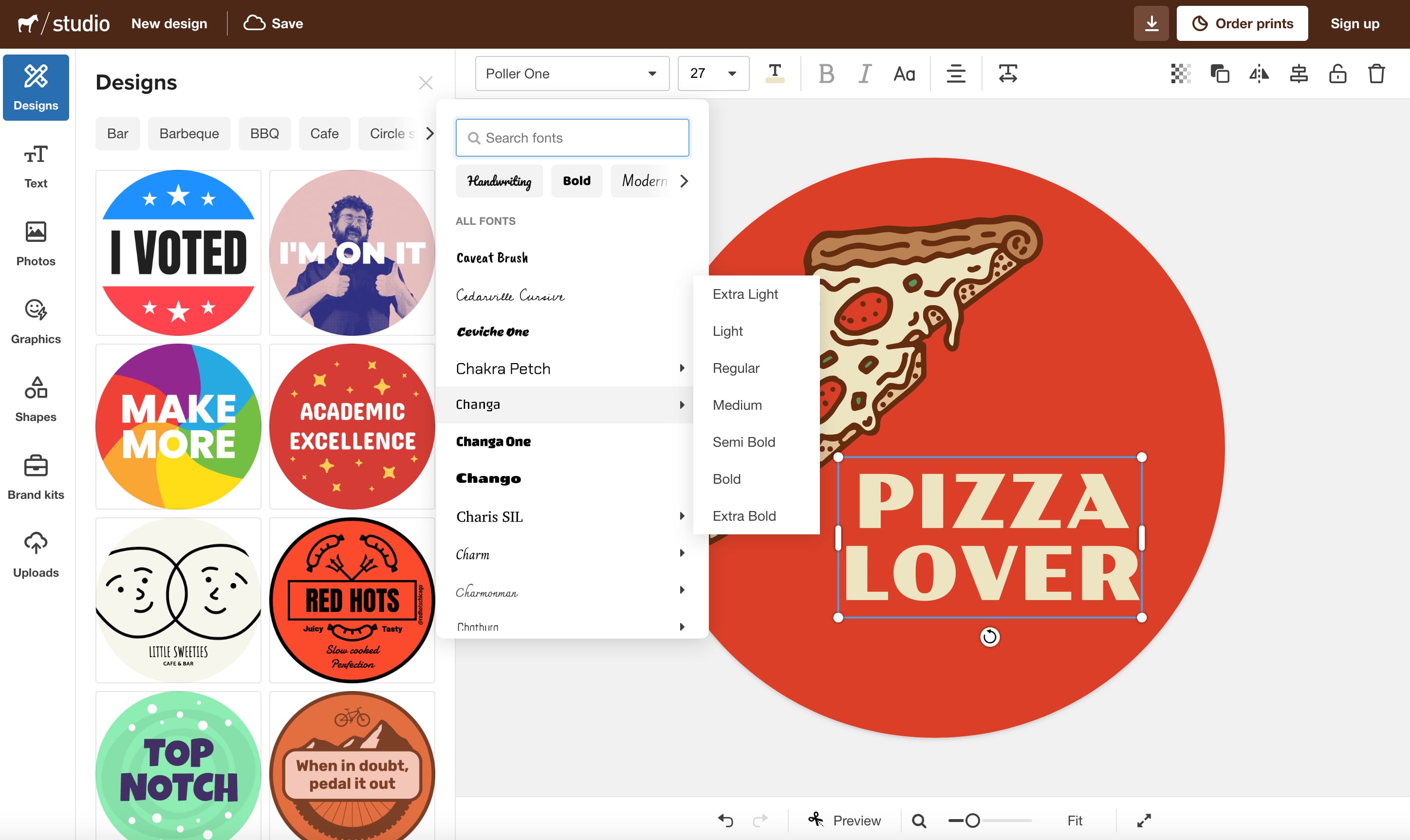
Tools like Adobe Illustrator or beginner-friendly platforms like Sticker Mule Studio can help you turn your sketch into a polished design.
If you're deciding between Adobe Illustrator and Adobe Photoshop, always opt for Illustrator. While many people use Photoshop for design, it’s primarily a photo-editing tool and has limitations for creating detailed designs.
For stickers, using vector files is recommended but not mandatory. As long as your design has a resolution of 300 DPI or higher, it should work well.
Choosing the right size
Sticker sizes vary depending on their purpose. For more basic stickers such as logos, a smaller size like 3x3 inches works well. More decorative stickers might need more space to highlight intricate details. Always consider the intended use of your sticker when choosing dimensions, and visualize how the size will look in real life once printed. The most popular applications are laptops, water bottles, cars, smartphones, and notebooks and planners.
Start by sketching your design on paper using a ruler to determine the ideal size. While you can always adjust it later, starting with a good approximation saves time. If you have a printer at home, you can test print to find the perfect size. Alternatively, you can use on-screen rulers to measure exact dimensions directly on your computer, which is especially handy if you're on the go and don’t have paper or a ruler nearby.
4. Design fundamentals
Stickers may be small, but effective design is what turns them into eye-catching pieces that stand out. From color to typography, and balance to visual hierarchy, understanding these principles will help you design stickers that not only look appealing but also communicate your message clearly.
So let’s break down some of these design fundamentals that can bring your sticker to the next level.
Color
Colors are more than just a visual element—they carry emotional significance and meaning. Choosing the right color scheme for your stickers is essential for conveying your brand's identity, personal style, and the message you want to communicate.
Here's how to approach color in sticker design:
Understand color psychology
- Different colors evoke different emotions. For example, blue conveys trust and professionalism, making it ideal for business-oriented designs. Yellow and orange evoke excitement and energy, appealing to a younger, more playful audience. Think about how your color choices align with the emotions and values of your target audience.
Use contrasting colors
- High contrast between colors is important to make your design pop, especially for smaller designs like stickers. Dark text on a light background or complementary color pairings like blue and orange can improve readability and create visual impact. Use tools such as Coolors or Adobe Colors to choose and edit color palettes.
Keep your brand in mind
- If you’re creating stickers for a brand, be sure to stick to your brand’s color palette. Consistency strengthens brand recognition, especially for promotional or marketing use.
Consider print color modes
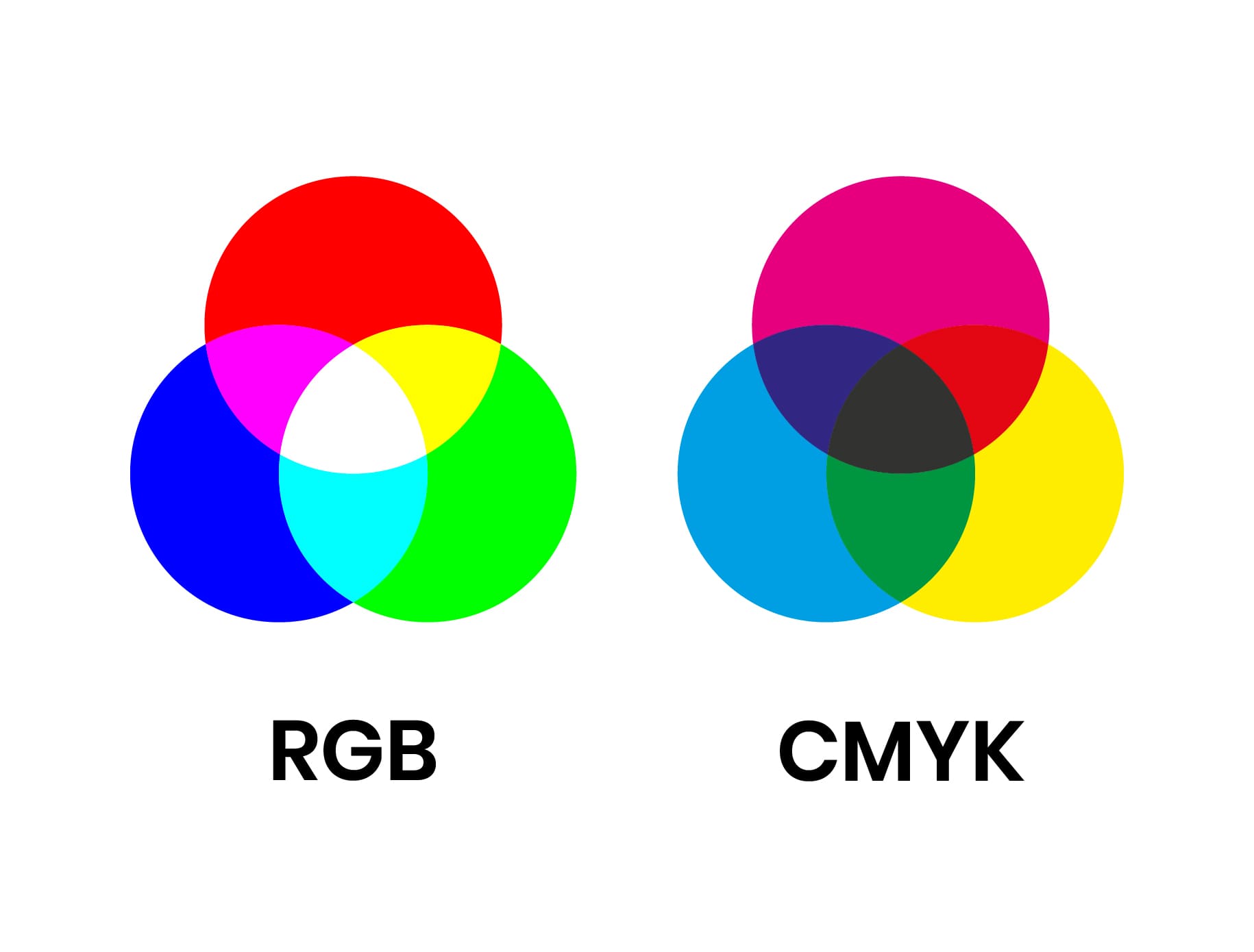
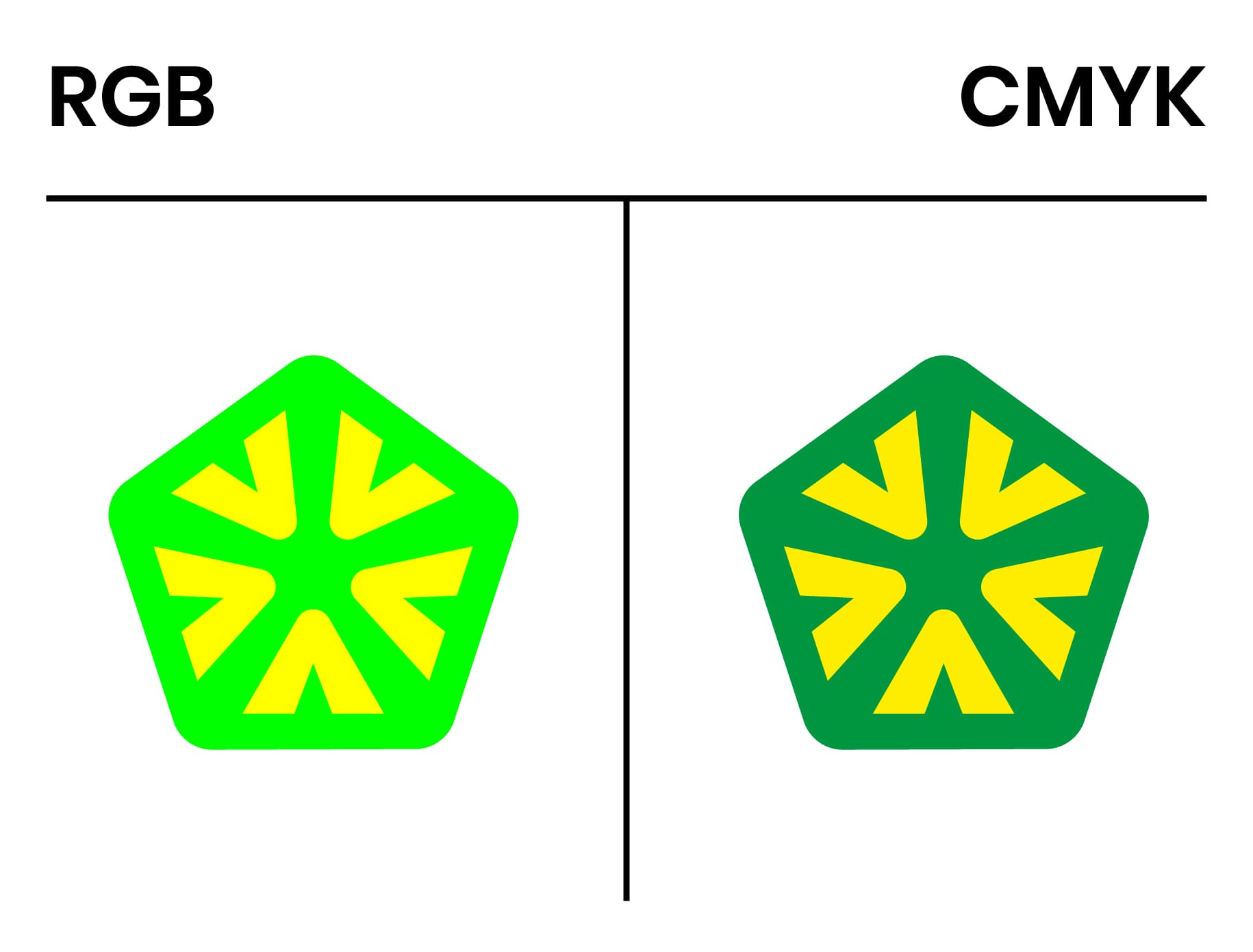
- While digital design often uses RGB (red, green, blue), printing requires CMYK (cyan, magenta, yellow, black) for accurate color reproduction. Convert your design to CMYK before sending it to print to ensure your colors appear as intended.
Some colors, especially bright ones, can look quite different in print if not properly adjusted. We do maintain your RGB color profile to achieve a better color match compared to converting to CMYK ourselves, but we would advise you to export in CMYK so you know what to expect from the final prints.
There are some tools that automatically convert them for you but always make sure to have a critical look at it before exporting your file.
Typography
Text plays a crucial role in many sticker designs, whether you’re including a catchy slogan, brand name, or even just a website URL. While typography can add personality and flair to your sticker, it’s important to prioritize legibility.
- Font choice
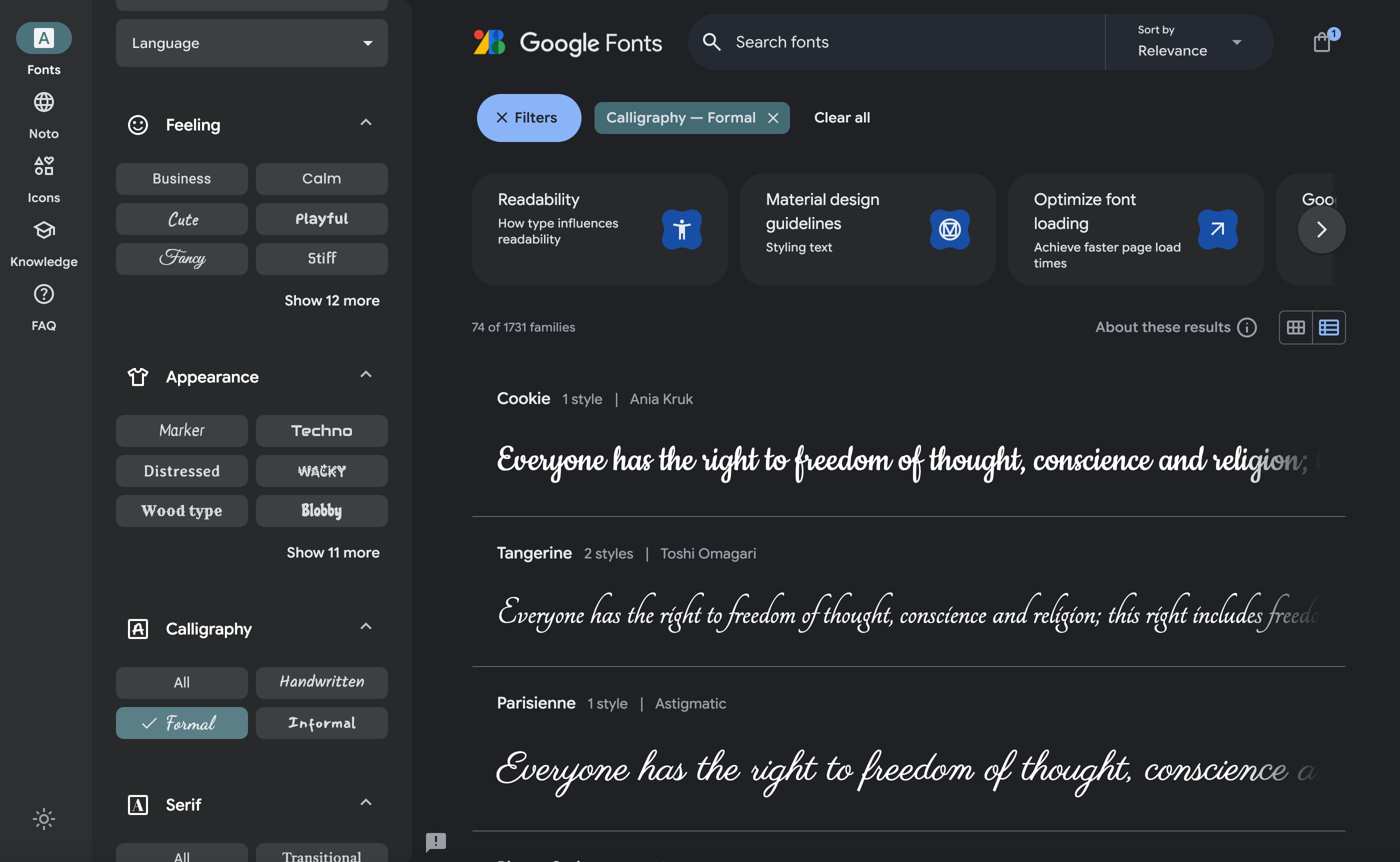
- Online platforms such as Adobe Fonts, DaFont, Google Fonts, and Font Squirrel offer free fonts that you can use on commercial projects. Filter on what type of font you are looking for and you’re well on your way to finding your perfect match. If you’re looking for paid fonts, MyFonts is the most popular option at the moment.
In our free Studio tool, you can choose between a range of hundreds of free fonts so you always have that perfect match you’re looking for.
Font pairing
- Don’t be afraid to mix fonts, but make sure they complement each other. Using one font for your main message and another for a tagline can help establish a visual hierarchy, guiding the viewer’s eye to the most important elements of the design. A good rule of thumb is to pair a bold, decorative font with a simpler sans-serif or serif for balance. Don’t make the difference between them too subtle, this will probably appear as messy and unintended.
Size and scale
- Because stickers are often small, your text needs to be readable at a glance. Stick to simple, bold fonts for text that needs to stand out. Avoid overly intricate or thin fonts, which can become illegible when scaled down. Try to zoom out while designing or walk a couple of meters back from your screen, this helps to get a better grip on how it will look at a certain size.
Expressing personality with fonts
- Your typography choices should also reflect the tone of your sticker. For example, playful, handwritten fonts can work well for a sticker with a casual, fun vibe, while a clean, geometric font might be better suited for a professional or modern aesthetic. We’re all about avoiding too obvious design decisions when it comes to stickers but sometimes it’s better to keep it clear and easy to understand.
Most free font platforms like Google Fonts give you the option to filter on certain values such as writing systems, languages, number of styles and most importantly, the type of font.
White space
Sometimes, less is more. White space refers to the empty areas in your design (which don’t necessarily need to be white). Far from being wasted space, white space is an essential design element that can dramatically improve the look and feel of your sticker.
- Improving readability
- White space helps separate elements in your design, making it easier for viewers to process the information. In text-heavy designs, adequate space around letters and words ensures clarity and legibility at a glance.
-Creating focus - By leaving enough white space around your key elements, you allow those elements to breathe and take center stage. This can be particularly effective for minimalistic stickers or designs where you want one element, such as your logo or tagline, to be the focal point.
Balancing complexity and simplicity - Don’t be afraid to leave certain areas of your sticker blank. Overloading the design with too many details can make it look cluttered and hard to read. Instead, focus on one or two key elements and use white space to give them room to shine.
Balance and composition
A well-balanced design feels stable, organized, and visually pleasing. In sticker design, achieving harmony between text, graphics, and logos is essential for creating a polished final product.
Symmetry vs. asymmetry
- Symmetrical designs tend to feel more formal and balanced, while asymmetrical designs can create dynamic movement and interest. Both can work depending on the mood you want to convey, but it’s important to be intentional about how you place elements in your design.
Visual weight
- Consider the visual weight of each element in your design. Larger, bolder elements will naturally draw more attention, while smaller or lighter elements may fade into the background. By balancing these elements, you can essentially guide the viewer’s eye through the design in the intended order.
Alignment and flow
- Good alignment creates a sense of order and professionalism in your design. Whether you’re aligning text to the center, left, or right, consistency is key. Additionally, think about how a viewer’s eyes will move through the sticker. Do they start with the main message and then flow to the details? Make sure your composition guides this journey effectively and test it out yourself.
Contrast and visual hierarchy
Contrast goes beyond color—it applies to size, shape, and typography as well. By creating contrast in your design, you establish a clear visual hierarchy, guiding the viewer’s eye to the most important elements.
This is especially crucial for stickers often seen from a distance or in passing, like those on car bumpers or laptop covers. Strong contrast ensures your design grabs attention and communicates effectively, even at a glance.
Size contrast
- Make the most critical elements of your design larger to emphasize them. For example, your brand name or slogan should be more prominent than secondary details like a website URL or tagline.
Font weight and style
- Bold, heavier fonts naturally attract more attention than lighter ones. Use this to your advantage by making sure your key message or headline is bold while supporting text can be smaller or in a lighter font weight.
Shape and form
- You can also use contrast in shapes and forms to create interest. For instance, pairing a bold, geometric shape with a more organic, freeform graphic can create an engaging visual contrast that draws attention.
Sticker shape
The shape of your sticker plays a significant role in its overall design and usability. Most vinyl stickers fall into these categories: die-cut stickers and kiss-cut stickers. Understanding how these types affect design is essential when you move from concept to print.
- Die-cut stickers
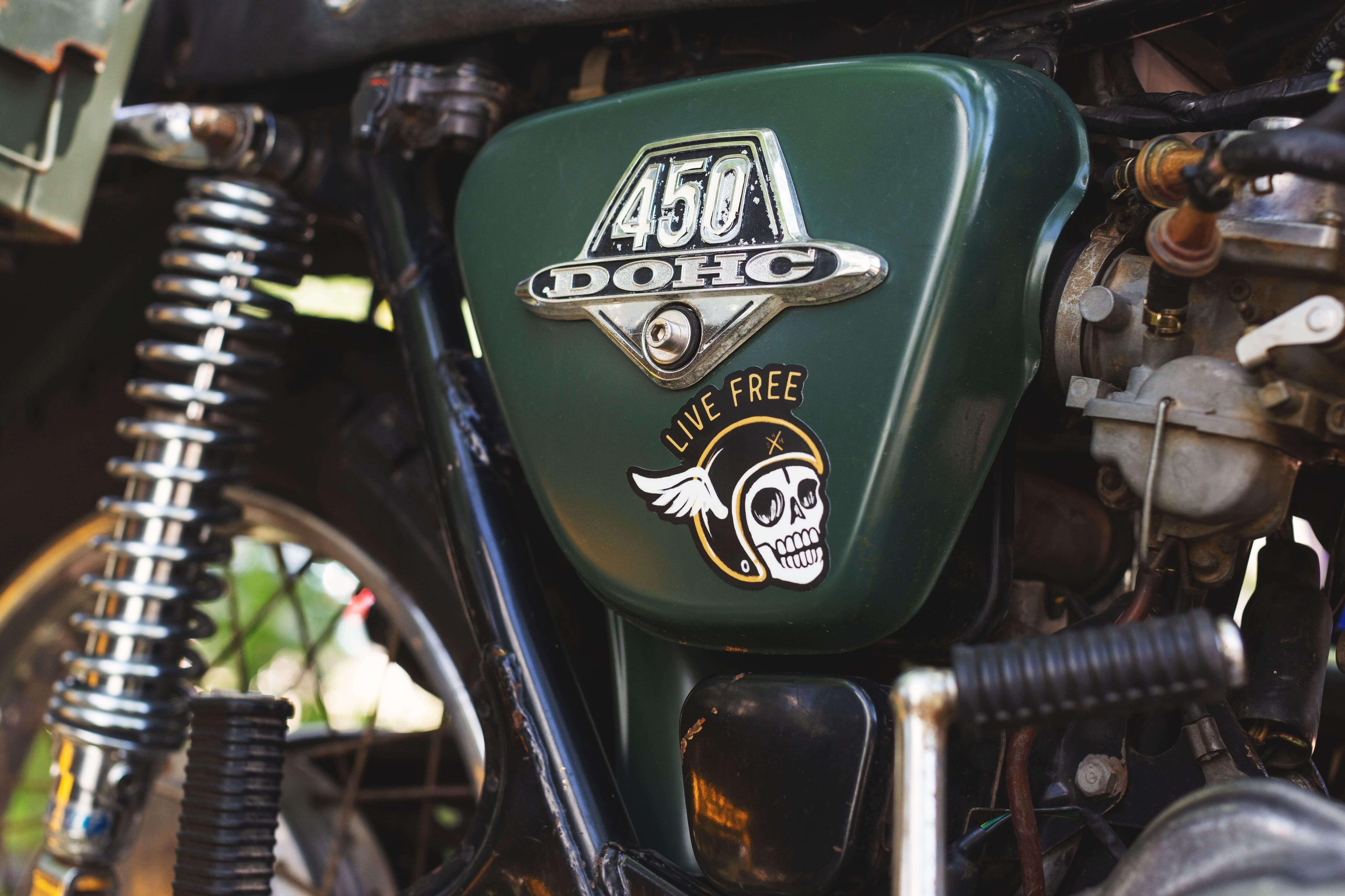
- Die-cut stickers are cut to the exact shape of the design, whether it’s a custom shape, a standard circle, or a square. When designing for die-cut stickers, ensure all elements stay within the cut lines. The shape should enhance the design, not detract from it. For instance, a logo with sharp edges might look better with a die-cut that closely follows its contours rather than being confined to a standard circle.
- Kiss-cut stickers
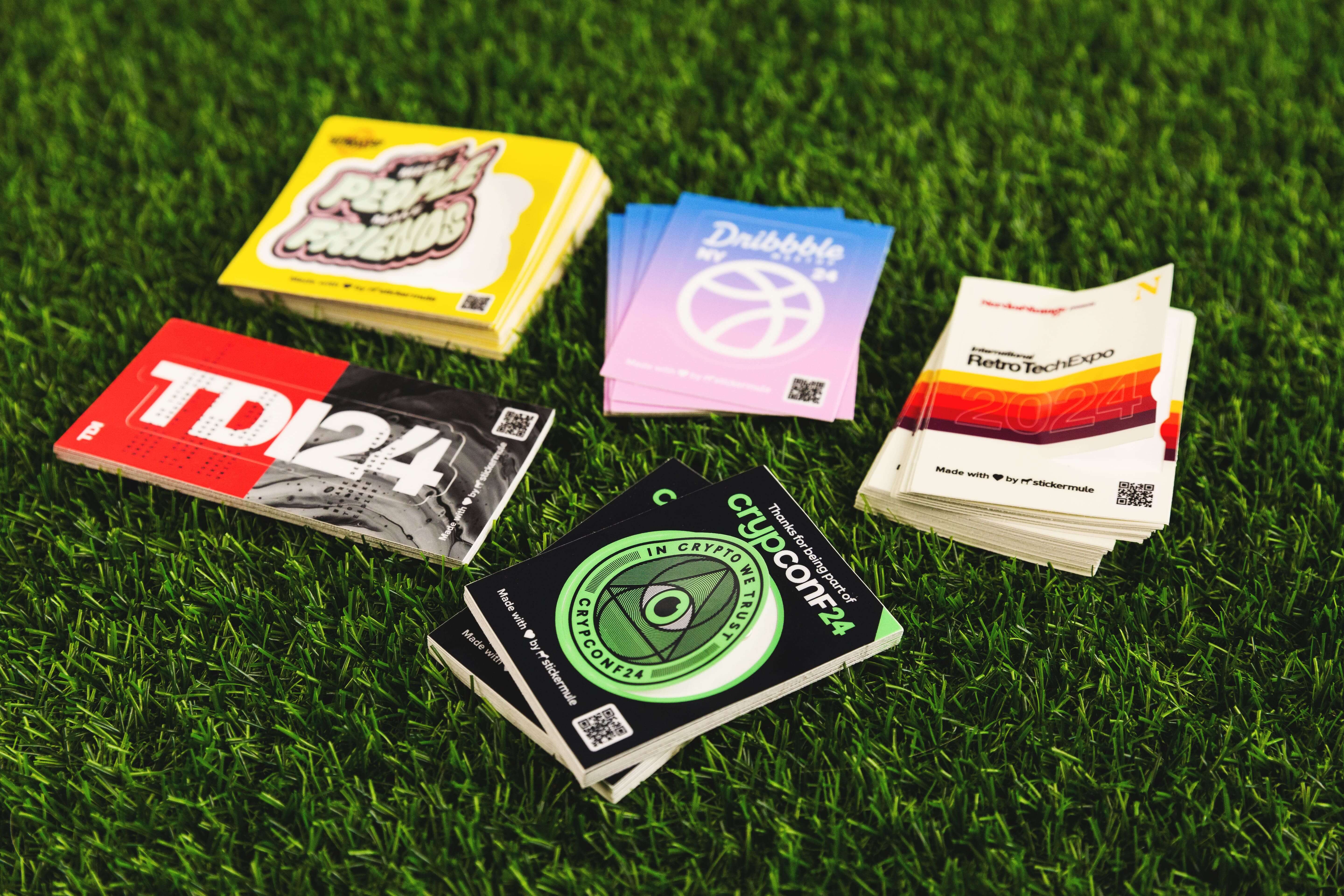
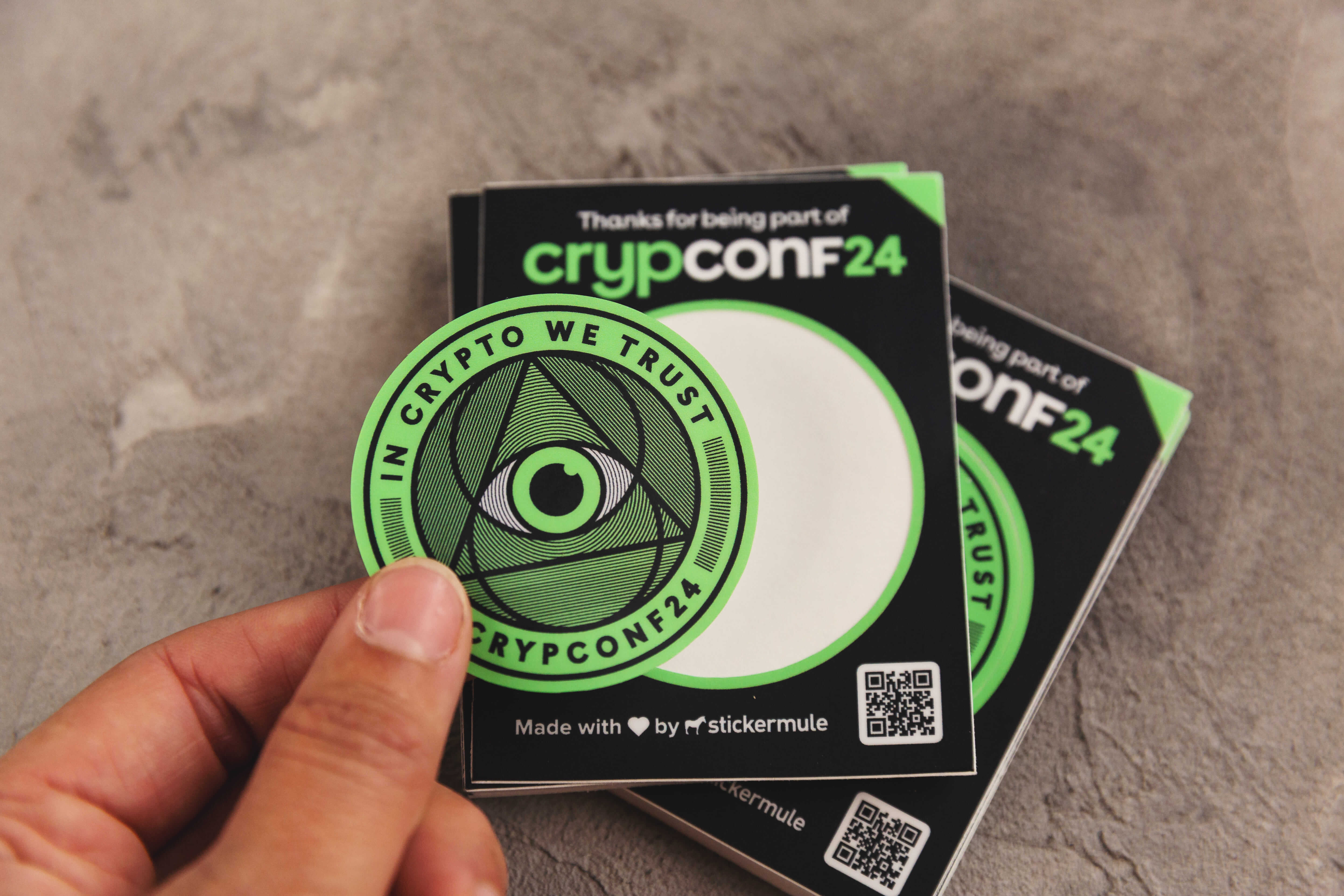
- Kiss-cut stickers are stickers that are precisely cut through the top layer of material (the sticker itself) without cutting through the backing paper. This leaves the backing intact, providing extra support and making the stickers easy to peel off. With kiss-cut stickers the backing paper can have a larger surface area than the sticker, offering space for branding, instructions, or additional designs. They're suitable for intricate designs, as the cutting process only affects the sticker layer while preserving the overall backing shape.
- Transfer stickers
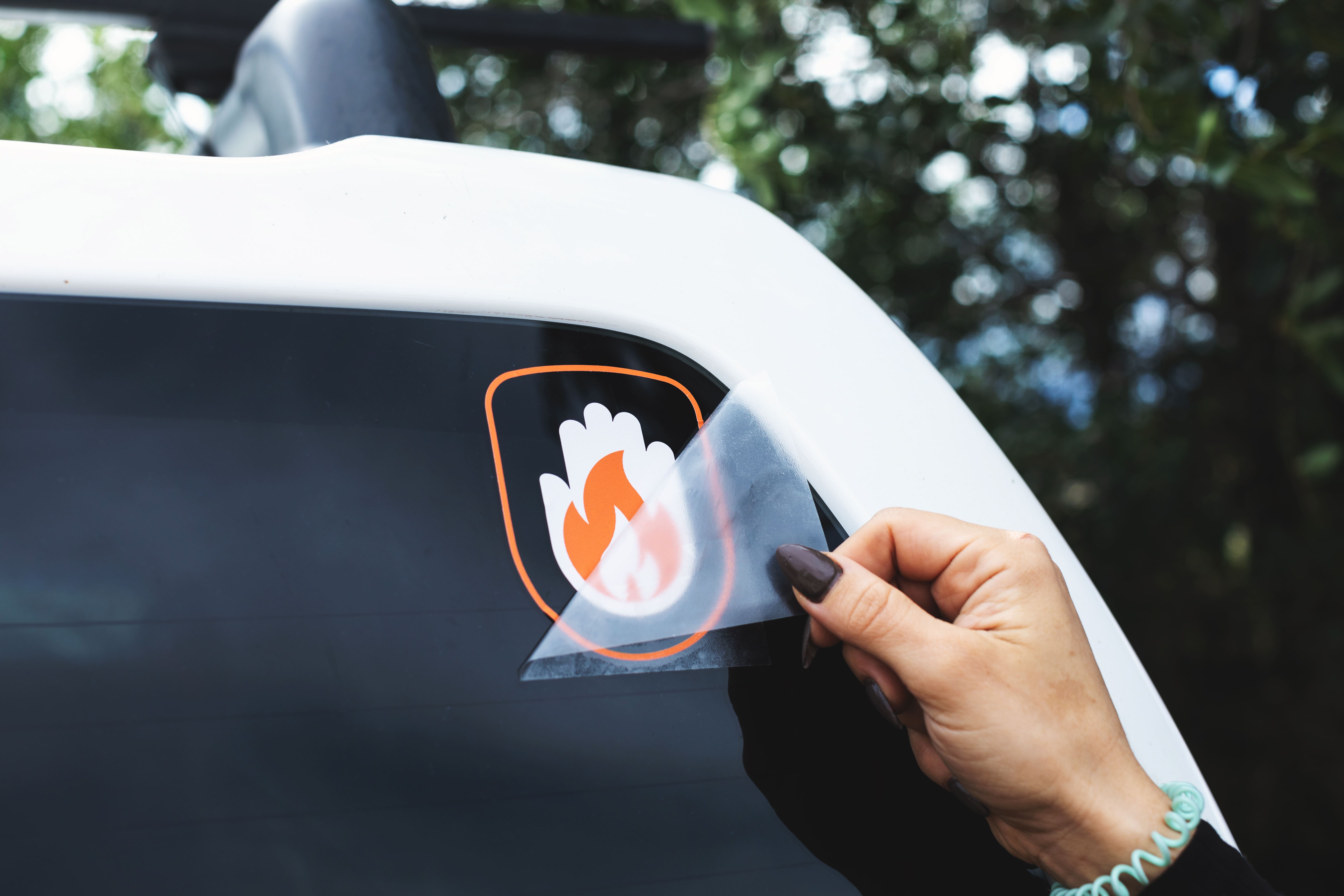
- Printed transfer stickers are a great option for designs that don’t need a solid background. Unlike traditional stickers, the individual elements of the design are attached to a transfer sheet, allowing for a clean, seamless application. All parts are applied at once, creating a polished, professional look.
Scale
It’s important to consider how your design will scale, especially if you plan to offer it in multiple sizes or other products like T-shirts or magnets. A design that looks great at 5x5 inches may lose detail or readability when reduced to 2x2 inches.
Test at different sizes
- Always preview your design at various sizes to make sure it remains clear and legible. Elements like intricate illustrations, fine details, and small text may need to be simplified for smaller stickers.
Use vectors for scalability
- As mentioned before, creating your sticker in a vector format makes sure that it can be scaled up or down without losing quality. Vector graphics are resolution-independent, making them ideal for printing stickers of any size. That same design of a 2x2” sticker could be turned into a full-size billboard without losing any quality. Pure magic.
By focusing on these design fundamentals, color, typography, white space, balance, contrast, and scalability, you can create sticker designs that not only look visually appealing but also serve their purpose effectively, whether that’s for personal use, branding, or marketing.
The key is to keep your target audience in mind and apply these principles thoughtfully to make your design truly stand out.
In Part 2, we talk about how to get your designs produced.

Comments