Making Sticker Mule simpler
Posted by Tom on
Just pushed some changes to make life simpler. Among them:
20% less header

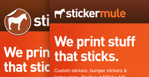
We shaved 20 pixels off the header and we're sporting a new logo. Logo design isn't exactly our expertise, but we felt the original logo had too much flair so we toned it down a bit.
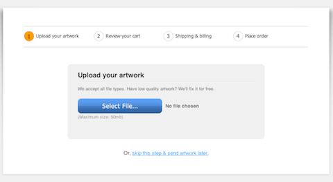
Clutter-free artwork uploads

A ton of pointless junk was removed from this screen. All that's left is a large "select file" button and a new progress tracker. A side benefit of the change is the page looks even better. :-)
Send artwork later
There's a new experimental option to send your artwork after ordering. We had a bit of a debate about this idea, but eventually decided to release it and see what people think. If you want to buy and don't have your artwork handy, you can email it to us at a more convenient time.

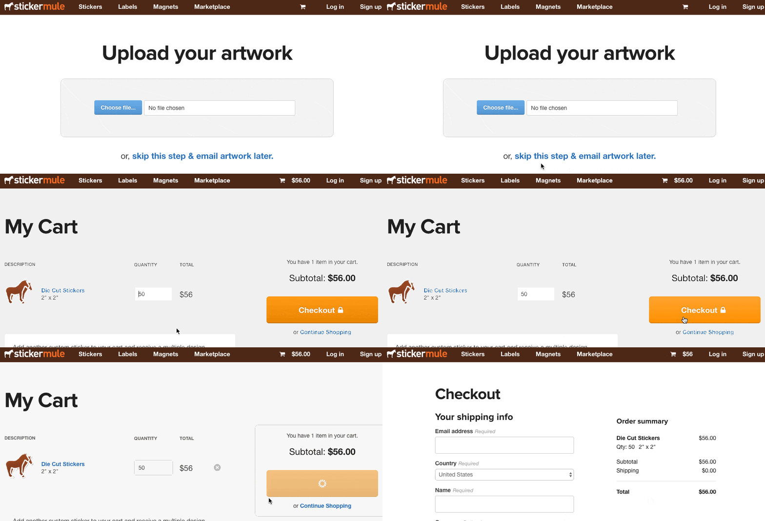
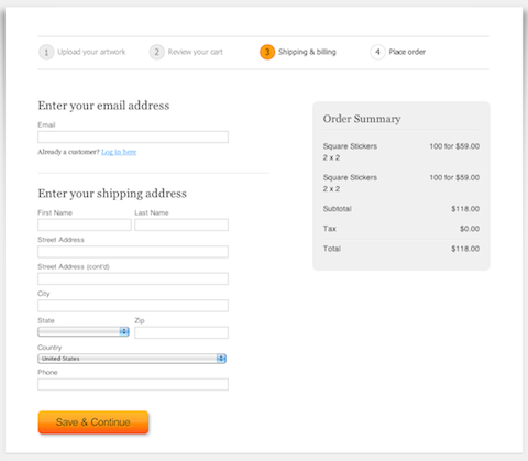
Checkout gets a facelift

Our checkout screens are prettier and simpler. It's not fun filling in forms; hopefully a little extra style and clarity make it more bearable. You can checkout without creating an account now too.
What's next
We're having a lot of fun building Sticker Mule. The good news is, we're far from done. As long as it's possible to make sticker printing simpler, faster and more fun we'll keep pushing updates.
Hopefully you like what we've done so far. Leave a comment or tweet @stickermule with your thoughts.