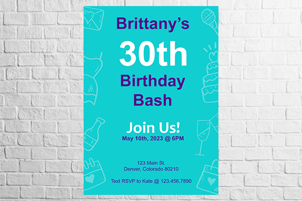
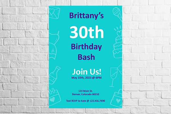
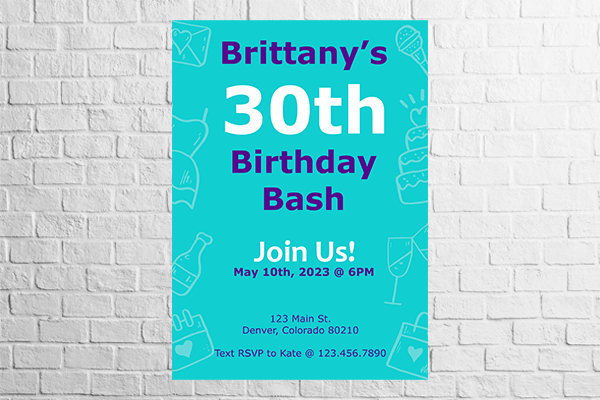
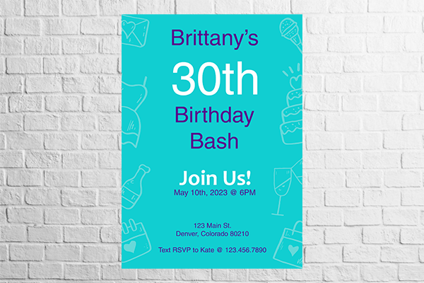
What is the easiest font to read on posters and flyers?
Posted by Sticker Mule on
There's a question that pops up often enough when you decide to design your own custom posters and custom flyers: What fonts should I choose?
It's a good, obvious question. But frankly, when you see so many hastily put-together posters or barely-legible custom flyers, you kind of suspect it's not taken too seriously.
The fact is there's a universe of fonts available out there, and an equally vast, encyclopedic amount of knowledge to match. Humble mortals with neither time nor inclination to pore over volumes of typographic lore and unravel matters of kernings and counters, block size and x-height, may be prone to… well, simply giving up and going with the first font that comes along.
And hence the same boring style posters and illegible flyers you see around.
But it doesn't have to be like that. Rightly chosen, fonts can convey professionality and authority or informality and friendliness. They can make for a clean, minimalistic style, or intricate, sophisticated designs.
Most importantly, they can be easy and pleasant to read — which is arguably the key element in text-intensive posters and flyers.
A quick note on serifs and how we read
To begin with, let's make one thing clear: We're not taking sides on the serif vs sans-serif debate. Nope. Instead, we'll simply present the facts of the matter. You be the judge.
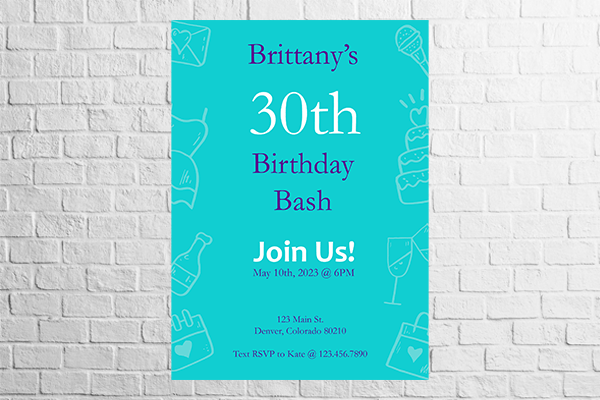
A serif, in case you don't know what it means, is that tiny finishing stroke or tail that completes a letter. Times New Roman has it for instance.
For a long time, it was argued that serifs guide the eye along a horizontal line since they help connect one letter to another. That was kind of their reason for being. But when we started switching from printed material to electronic screens, that little extra spec was shown to create too much visual noise in small screens and very diminutive text.
So most of the fonts born of the digital age are in fact clean, sans-serif (that's French for "without a serif", by the way. Fancy!) Like the one we're using now.
Also, it turns out that we don't actually read in a clean horizontal left-to-right line. Rather, we scan pages up and down and often follow something like an F letter, drawn from top to bottom. So the serifs really lost a lot of their relevance, except as a style device.
What makes a font easy to read?
OK, so what really makes a font easy to read is a combination of several aspects, including the following.
Color contrast. Ever had the bad luck to sit through a presentation where yellow letters are shown over a white background? Yeah, contrast is key.
Kerning. We're getting a little terminological here, but kerning is simply the spacing between letters or characters. Too little kerning typically means poorer legibility in small types (as the ones often used in leaflets).
Font size. This is a pretty obvious one, but still surprisingly easy to get wrong. Obviously, the font size in a poster will differ from that in a leaflet, but how the size connects to the other elements in your design is a key element to readability.
Whitespace. That's all of the space in your design that's not taken by text or graphics. Too little of it and your text will lack air and be hard on the eye; too much and it'll get lost in the middle of the page.
Leading. That's the vertical space between one line and the next. Again, too little leading complicates reading; too much makes each line seem disconnected from the next.
Alignment. How aligned your font is to the left or right impacts readability a good deal. Typically, we're more used to left-leaning alignment, but you don't want to overdo it and go hard left either!
Hierarchy. This deals with the key points in your text — those that should attract the reader's attention first. Proper hierarchy can be achieved with a mix of style elements such as bold or italics. However, be wary of overusing these elements. It is typically a good rule of thumb never to use more than one way of setting text apart (no bold + italics, please).
Complementary fonts. A clever device in hierarchy and a common technique in poster and flyer designing is employing different, but complementary fonts. That's an art in itself, but you can benefit from the many ready-made suggested pairings on the web or harness the power of AI with Fontjoy, which will suggest unique pairings for you.
What are the best fonts for posters and flyers?
Armed with all this knowledge, we can finally look at some of the easiest-to-read fonts for flyers and posters.
Serif fonts
Let's begin by looking at four serif fonts for posters and flyers.
1. Times New Roman
Created for British newspaper The Times in 1931, Times New Roman has since established itself as one of the primary, most respected, and well-known typefaces, including on the web — it's what every unformatted HTML text looks like.
For a respectful, sober, and professional look, you can never go wrong with Times.
2. Garamond
Harking back to book printing in Renaissance Italy, Garamond is another timeless serif font that is incredibly easy to read in leaflets or larger printed materials. And in spite of being literally a centenarian typeface, Garamond has lost none of its actuality. It's still a common and respected choice in modern design.
3. Georgia
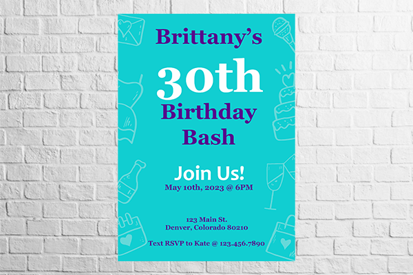
Going back to something a little more recent, we have Georgia: a font invented for none other than the Microsoft Corporation in 1993. And guess what, it was invented especially to be legible in small screens, meaning it'll never fail you in a leaflet either.
4. Trajan
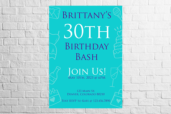
Trajan is also a recent creation (1989), but is inspired by a very ancient letterform — the Roman square capitals used at the base of Trajan's Column, in Rome. There's a classic for you!
Trajan was created for large displays, rather than printed text, making it a perfect font for a very classy-looking poster.
Sans-serif fonts
Serif-less fonts tend to be preferred nowadays for a more minimalistic and clean style. You can't go wrong with any of the choices below.
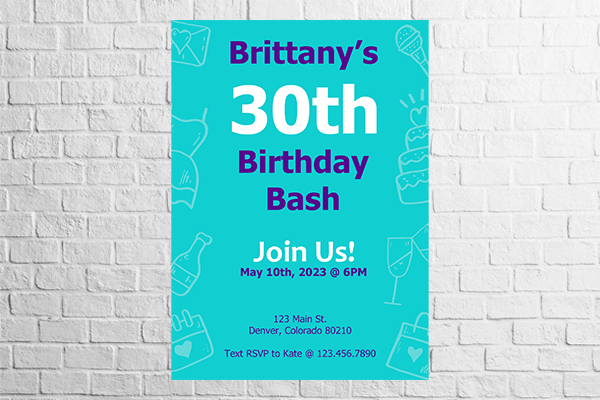
1. Arial
Arial was created for computers, is in every computer, and has been in every computer since its 1982 inception. It's a simple, some would say boring, font, but it gets the job done.
2. Calibri
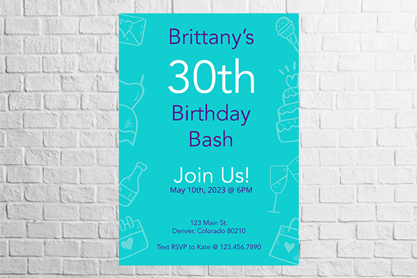
Calibri is another so-called "humanist" typeface, meaning it takes inspiration from classic Roman types, as well as calligraphy. Replacing Arial as the go-to for many of the Microsoft products since 2007, Calibri is a bit more rounded, a bit more modern, and a tad more spaced apart.
3. Verdana
Verdana letters are also a little more spaced than Arial types, making them easy to read even with considerably reduced sizing — flyers, anyone? But it's also heavier than Calibri, making it an apt choice for poster headings.
4. Helvetica
Similar to Arial in terms of letterform and weight, Helvetica brings a sophisticated, but simple-looking aesthetic that gives it great popularity in modern design trends.
5. Tahoma
Another recent, digital-era invention, Tahoma is a clean, professional-looking font that makes for easy reading on both digital and printed screens. Popular with resumes, it can also be just the right fit for the body of your flyer.
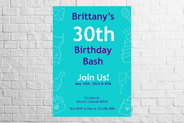
6. Trebuchet MS
If you want a font named after a badass medieval siege weapon, look no further than Trebuchet. A sans-serif font with a lot of serif envy, Trebuchet is a neat middle-ground between modernity and antiquity that will serve your flyers well.
7. Roboto
Roboto was invented by Google and has been the go-to font for Android devices for 10 years now. Remember how we mentioned counters earlier on? That's the empty space within each letter. Well, Roboto's counters are huge, meaning it is extremely legible in even very small prints.
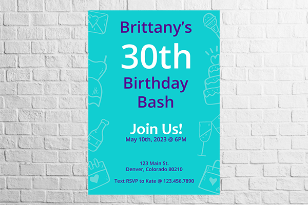
8. Open Sans
Open Sans was also designed by Google for a "neutral, yet friendly appearance". It works great for any medium, print or digital, and is pretty professional-looking too!
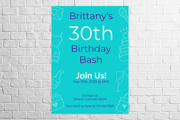
9. Montserrat
I just love Montserrat — it's so classy. And guess what: it takes inspiration from street posters in the historic Montserrat neighborhood of Buenos Aires. Now you cannot not love it.
Montserrat is eminently readable, fairly round, and of course, awesome for posters.
10. Avenir
Named after the French word for "future", Avenir exudes a combination of modern elegance and simplicity that make you think of a very avant-garde-looking New York café. For much the same reasons we saw above, it's easy to read in large or small prints and a fantastic way to give your posters a touch of style.
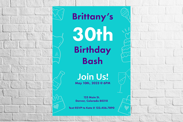
11. Futura PT
The Futura typeface was created in the early 20th century and took inspiration from the Modernist art movement for a balance of simplicity, clarity, and functionalism. It's a rather austere German font, and it can be paired well with serif fonts such as Times and Garamond.
12. Bonus font: OpenDyslexic
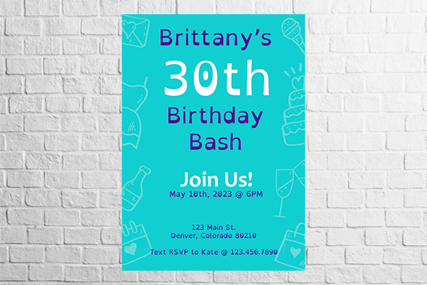
OpenDyslexic is a free font that addresses common issues that hamper dyslexic persons' ability to read. Very different from all the classic and modern options seen above, OpenDyslexic has a somewhat blotted look that won't be popular with everyone. But it can be a great — and inclusive — option depending on your specific use case. And it's definitely an easy font to read on flyers or posters.
Finishing strokes
All of the above fonts will do just fine in your poster or flyer, but they're just a stepping stone into the beautiful world of typography. There are a million other options out there, for those of you inclined to explore and be creative.
Just remember that both legibility and readability are a fruit of a combination of style elements. So look for the perfect font, but remember spacing, alignment, contrast, and the like.
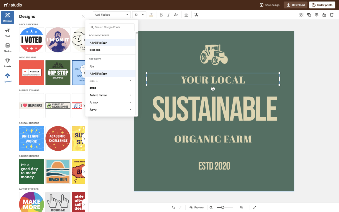
If you want to test different fonts and pairings, remember you can always enjoy our web-based design app, Studio. It's free and a joy to use!
