How to make stickers look professional
Posted by Sticker Mule on
Stickers are great for business and branding. But no one wants ugly stickers. And your business might not have a big design budget. So how do you make high-quality, aesthetically pleasing stickers?
Here are 8 tips anyone can use to make their sticker designs look professional.
1. Define your brand identity
Your business should have its own personality. Who are you trying to sell to? What is your message? Your visual identity should reinforce these ideas.
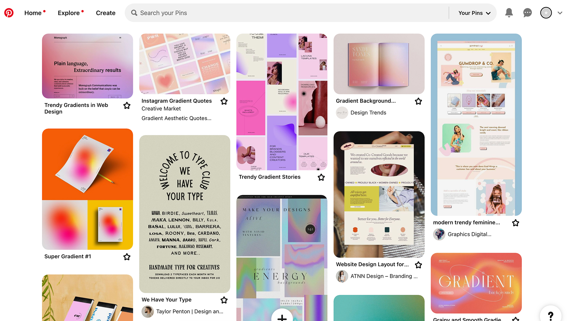
Before you get to the design itself, put your Art Director hat on and decide what your brand identity should look like. Use a tool like Pinterest to gather ideas and create a mood board for your brand identity.
Try to narrow it down as much as possible – it’s important to have a consistent style.
2. Choose the right color palette
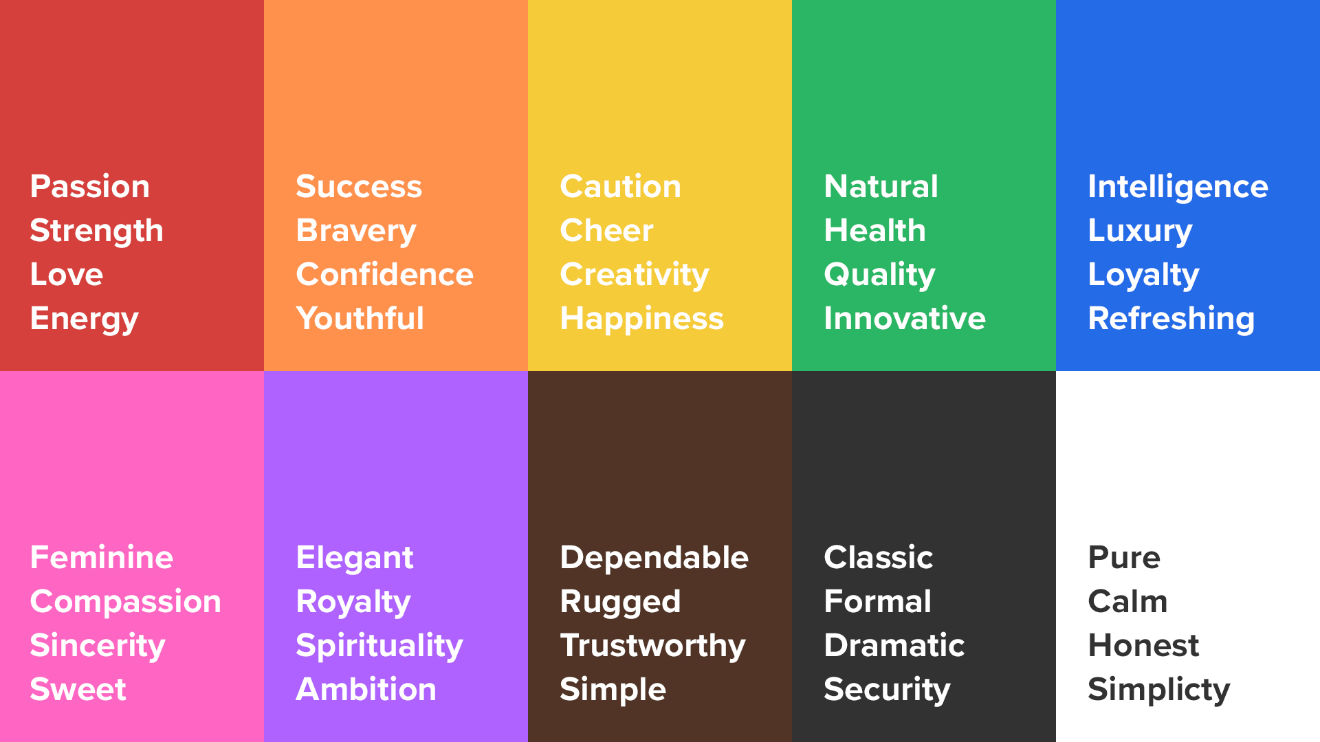
Colors impact the perception of your brand.
Each color evokes an emotion. Blue = trust. Green = nature. Yellow = creativity.
Decide on 1-2 main colors you want to represent your brand.
Use a free tool like Coolors to create a color palette.
3. Select appropriate typography
The font you choose for your brand is very important. Study the designs you like from your mood board. Identify attributes in the fonts that might work best for your brand.
Use a site like Google Fonts to browse and download free fonts.
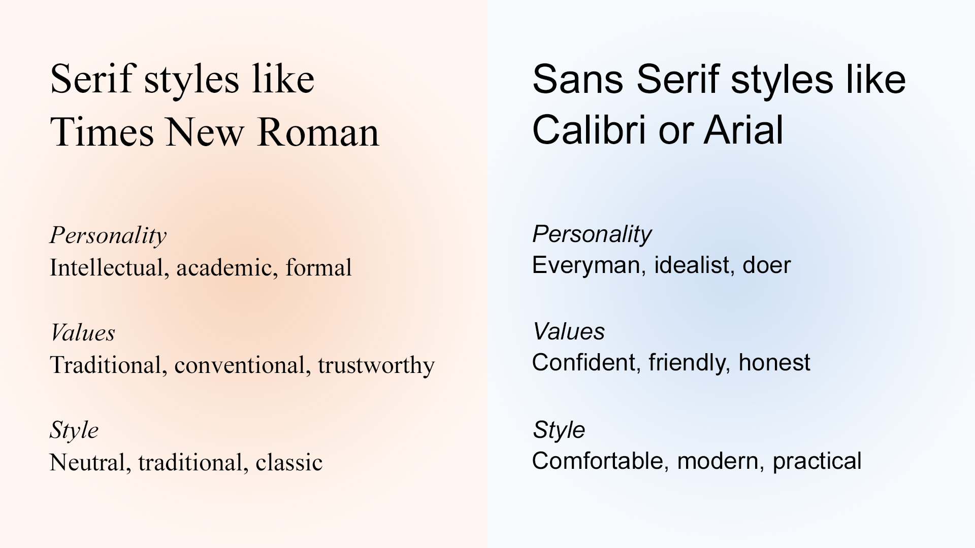
Serif vs sans-serif
Serifs are the fancy little decorations on the ends of each letter.
Serif fonts are often used to convey a formal, serious tone. While sans-serif fonts convey a friendly, casual tone.
Font weight
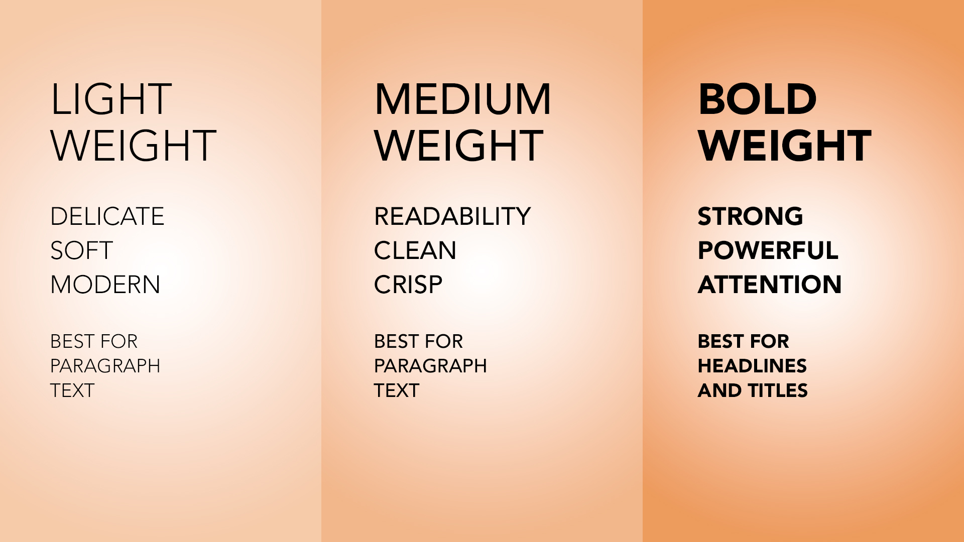
Many fonts include multiple variations of weight (i.e. light, normal, bold).
The thickness of your font will also impact the tone of your brand. Thinner fonts usually convey a more delicate, feminine tone. While bolder fonts convey a strong, masculine tone.
4. Use high-quality images and graphics
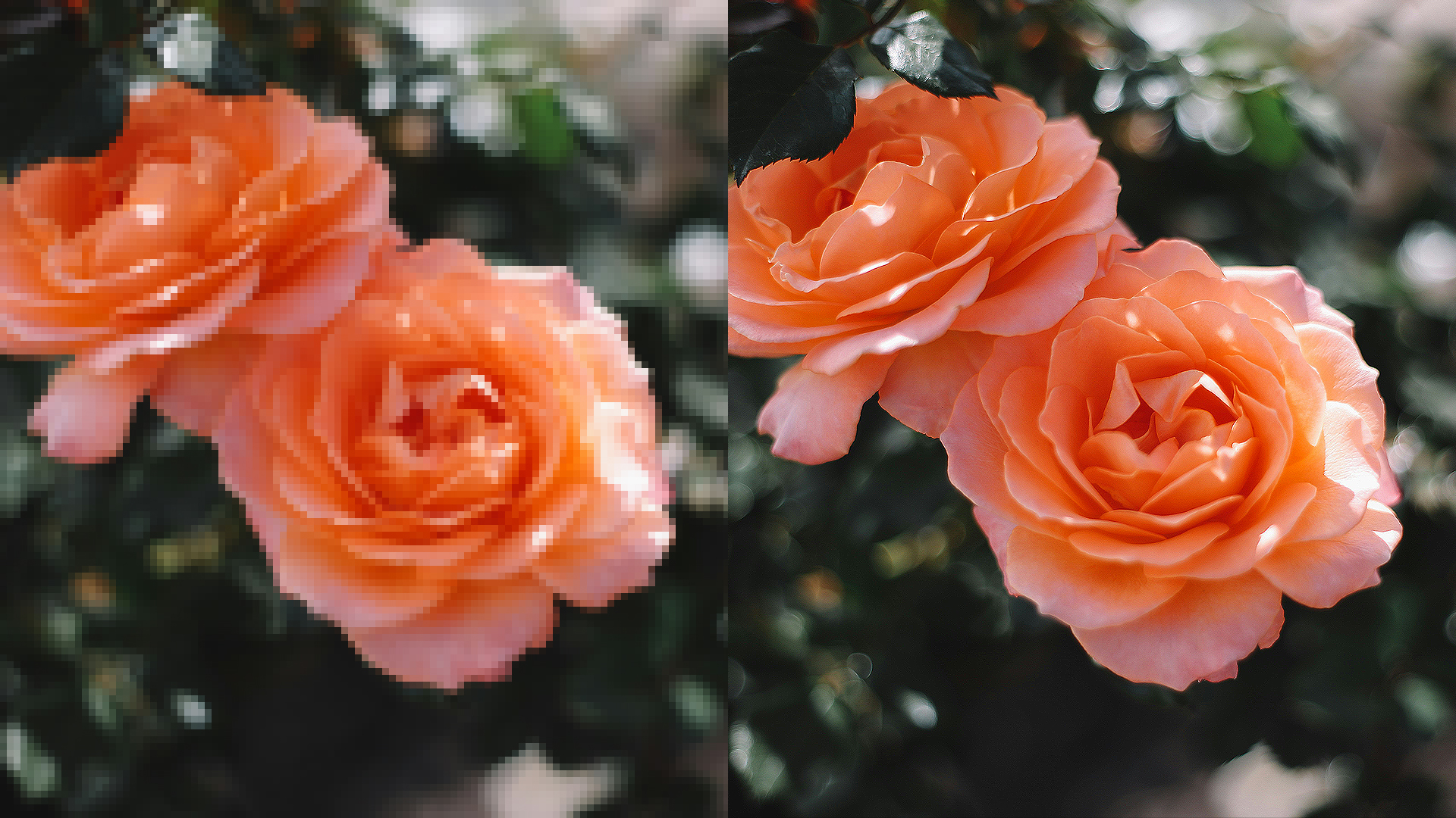
Anything you print should be at least 300 pixels per inch. This will ensure your stickers don’t look pixelated or blurry.
If you have various versions of your logo or design, use a vector file (.pdf, .ai, .eps) if possible. Vector graphics can be scaled infinitely without losing resolution. You can transform any image to vector format for $14 using Redraw.
Or if you have a particular photo or image that you need to use, but it’s not high resolution – you can make high resolution with another free tool, Upscale.
5. Keep your design simple
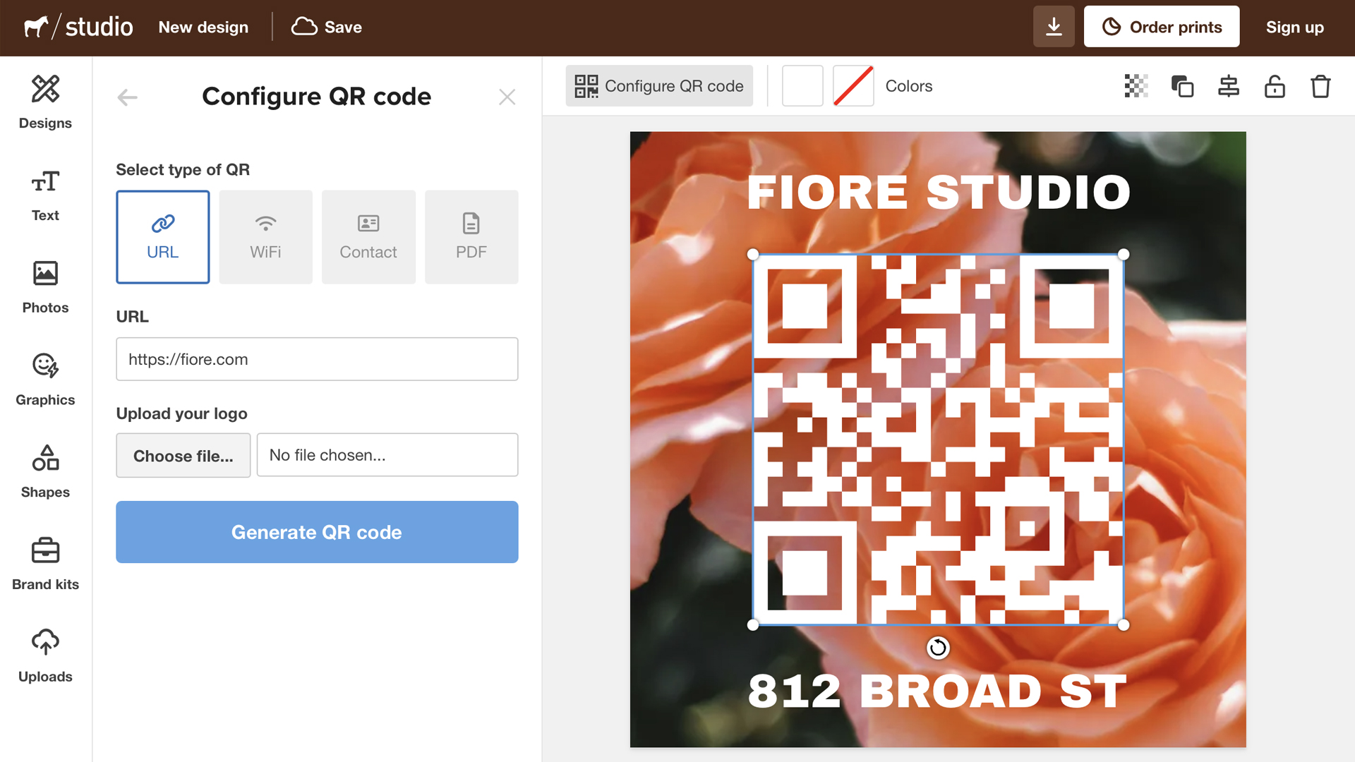
You can create high quality designs using our free design tool, Studio. Choose from hundreds of professional templates or start from scratch.
The best sticker designs are usually simple.
Don’t include more information than you need. If you want to include some sort of contact information, consider limiting it to one form of contact (i.e. email address). Or you can add a QR code to direct people to a specific landing page.
6. Experiment with shapes
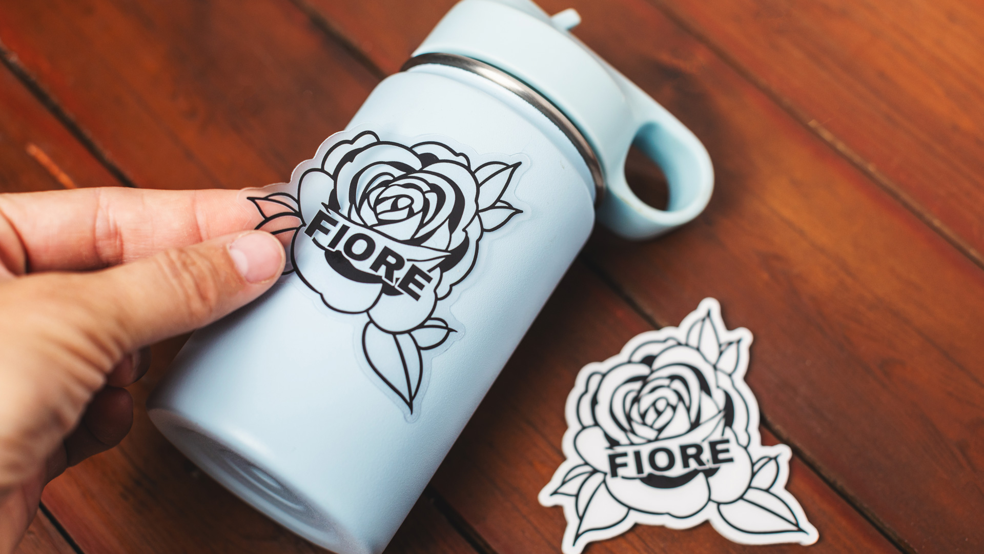
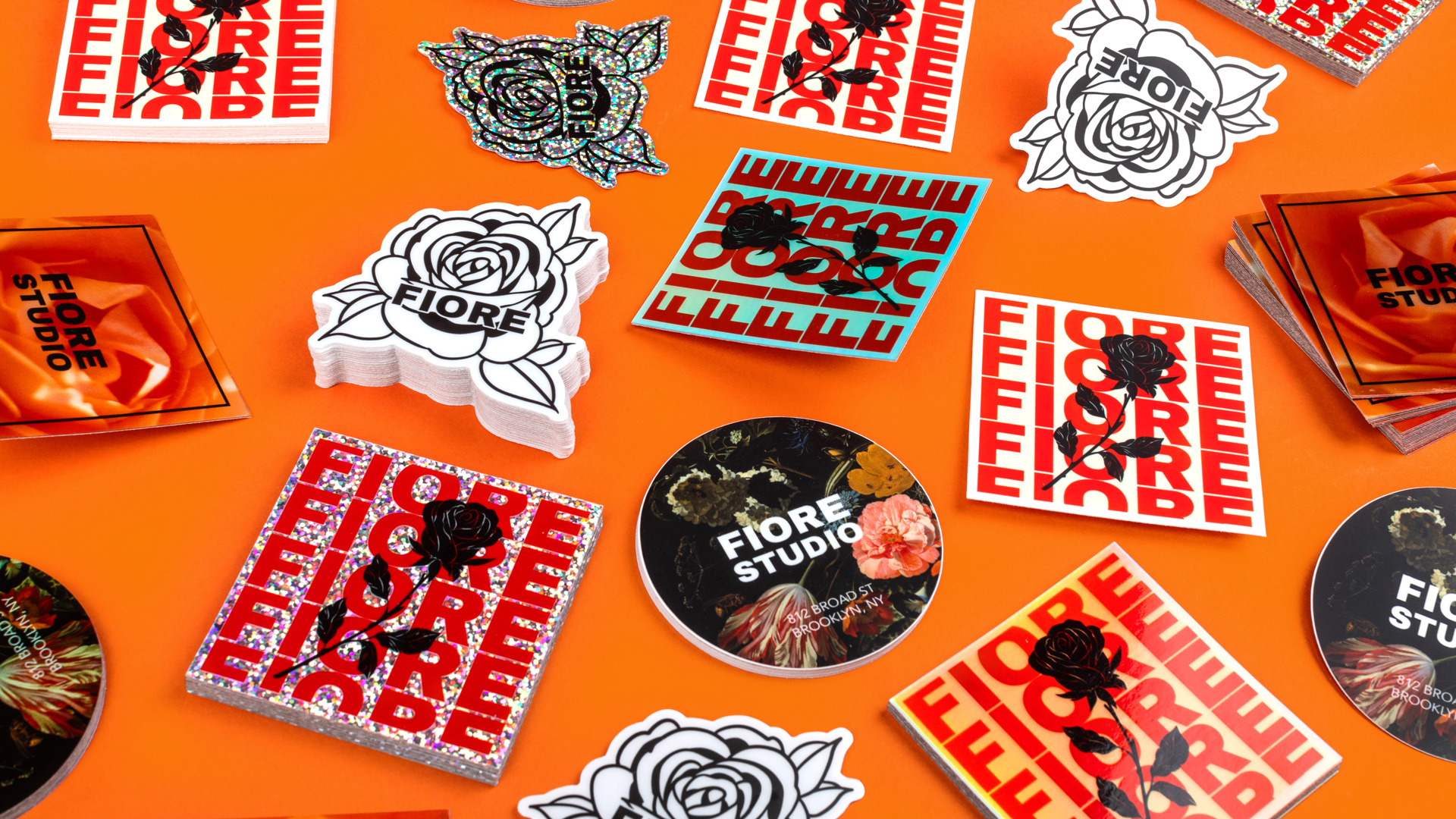
Keep in mind that die cut stickers will automatically be cut to fit the shape of your design. This works great for plenty of designs and most logo stickers.
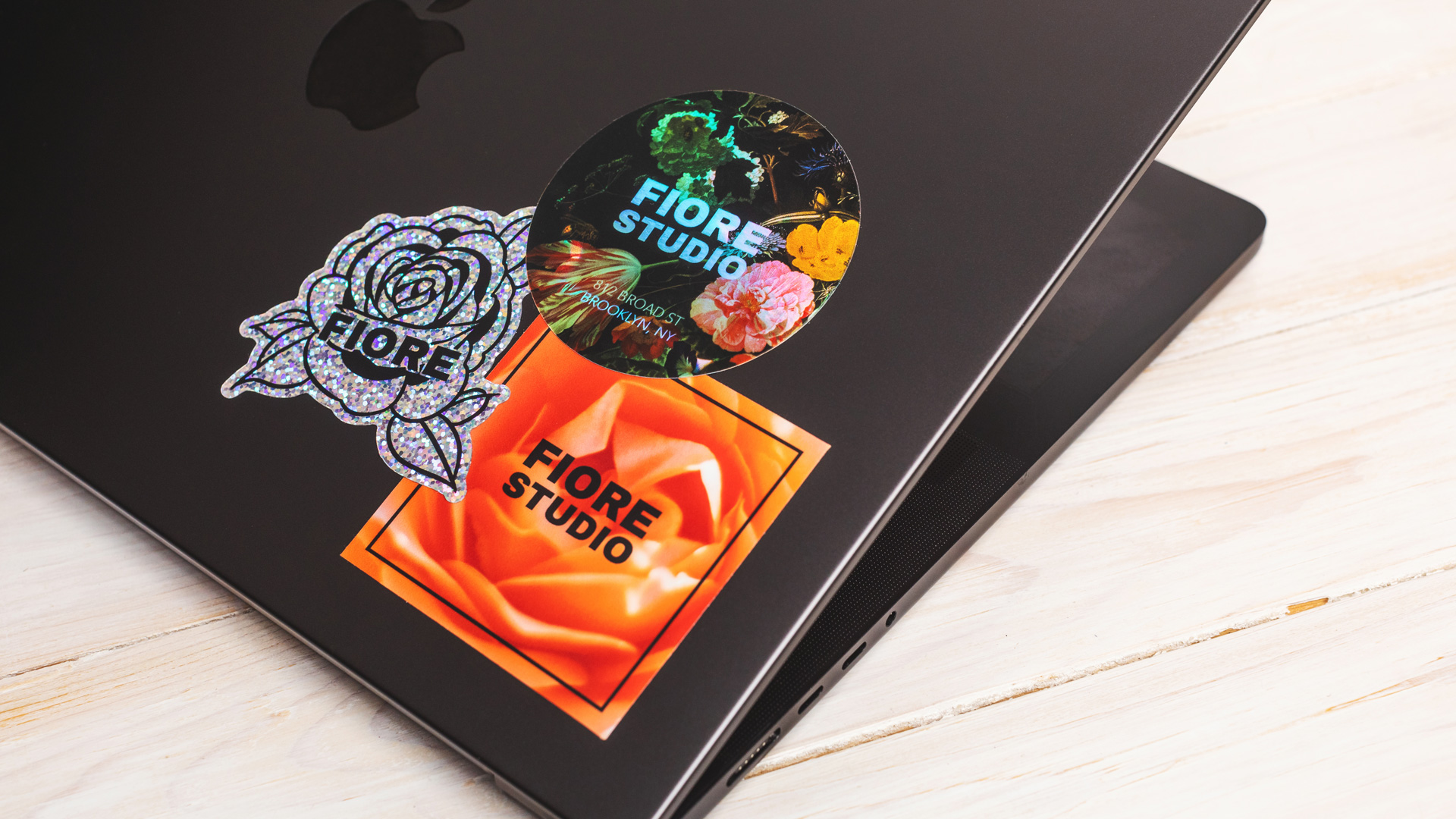
But depending on your design and brand, you might want to go for a more traditional shape, like circle stickers, square stickers, rectangle stickers, oval stickers, or rounded corner stickers.
7. Consider the finish
Any sticker is going to look good with a matte finish. But depending on your design you may want to try a holographic or glitter material to give your stickers a unique shine.
8. Get feedback and iterate
Before committing to a large batch of stickers, you can order custom samples. This is a good option for testing your design in real life.
Give some stickers away and ask your friends and coworkers for feedback. They might be perfect or you might need to tweak a few things. Shop with confidence when it’s time to place a larger order. And you can even save money when you order multiple designs at the same time.
Conclusion
Getting professional stickers doesn’t require a professional designer. Be thoughtful about what you want, look to other designs for inspiration, and always be willing to experiment.
Comments