6 ideas for poster making and 5 free poster templates
Geplaatst door Sticker Mule op
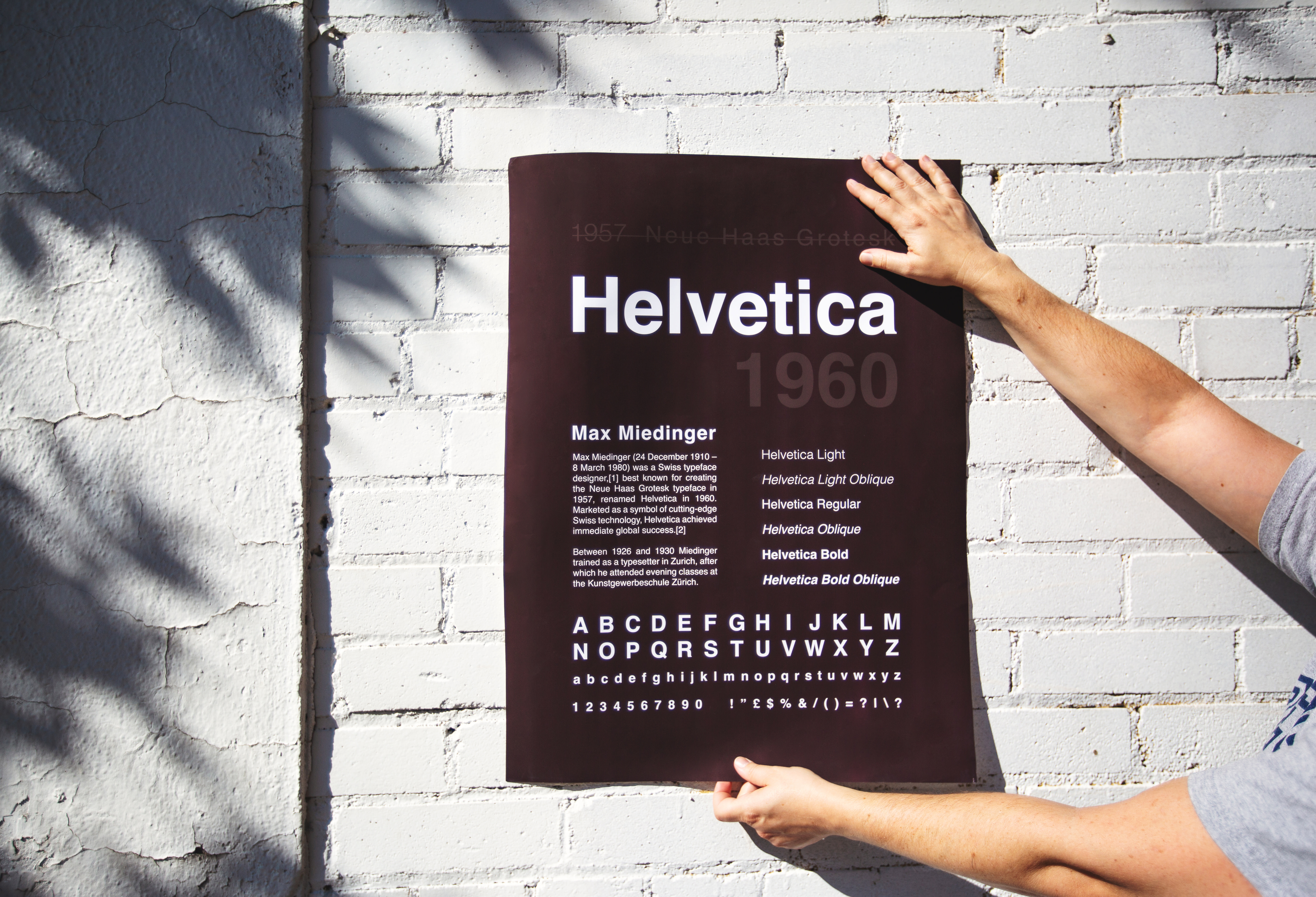
Poster making can be a fun and effective way to communicate a message or convey information. Whether you are creating a poster for a school project, a community event, or a scientific conference, there are several key elements to consider when designing your poster.
Follow these ideas to create a poster that gets your message across and resonates with your target audience.
1) Design a visually appealing layout
Make your design pop with the right combination of text, images, and graphics. But — and we can’t stress that enough — don’t go overboard with an excessively fancy style.
When designing your poster, simple is often best. Research has shown readers are more likely to understand and accept as true a message communicated in an easy-to-read format. So use a consistent color scheme and font to create a cohesive look and make sure to leave enough white space to avoid a cluttered appearance.
You can use images and graphics to illustrate your points and make your message more memorable, but be sure to use them in moderation and ensure they are relevant to your message.
2) Use strong, clear headlines to convey the main message
A pithy headline is a perfect way to grab the attention of your audience and convey the main idea of your poster. Remember: attention is a scarce resource, so make sure your headline is clear and concise — something that immediately catches the eye.
Use subheadings if you need to provide more detailed information, but be sure to keep them short and to the point.
3) Employ white space to create balance and clarity
Don’t forget the role of white space in a clear and readable message. Also known as negative space, this is the area around and between the elements of your design. White space is a key element of design, as it gives your message balance and clarity, making it easier to read and understand.
With clever use of white space, you can also draw attention to specific elements of your design and make them stand out.
4) Illustrate your points with images and graphics
There’s a good reason why we say an image is worth a thousand words. Sure, it’s cliché — but it’s often true. Because we are visual creatures, the right image in the right place can make your message infinitely more engaging, hammering your points home in a powerful and memorable fashion.
Once again, though, just be sure to use imagery and graphics in moderation and only when relevant to your message.
5) Make your poster interactive with QR codes or games
Another way to make your poster more engaging is with interactive elements, such as QR codes or games. QR codes can be scanned with a smartphone to access additional information or resources, while some kinds of games — such as a hidden object game — can be a fun way to make people stop and look at your poster
6) Consider your purpose and audience
What is your poster for? Who is going to be looking at it?
These are two questions you should always ask yourself while designing your poster.
From visual style to your choice of words, everything can hinge on your target audience. Where a poster for a scientific conference may call for somewhat technical language and detailed information, a poster for a community event may go with a more straightforward tone, including images and graphics that appeal to a wider audience.
5 free to use but professionally designed poster templates
In addition to providing free, professionally designed poster templates below, we also offer a free online poster maker — Studio — that you can use to customize and edit the templates. Our online poster creator is user-friendly and easy to use, even if you don't have any design experience, and will be sure to supply you with some fresh ideas for poster making.
To get started, simply choose the poster template you want to use, then add your own text, images, and graphics using our editor. There are plenty of font styles and sizes to choose from, as well as tools to adjust the layout and formatting of your poster. You can also use the maker to add interactive elements, as suggested above.
Using our poster maker is a quick and easy way to create a professional-looking poster tailored to your needs and message. And did we mention it’s free? Give our poster maker a try right now and see what you can create!
Independent design meetup template (start designing)
Farmer’s market poster template (start designing)
Live music every night poster template (start designing)
Hellbound skate contest poster template (start designing)
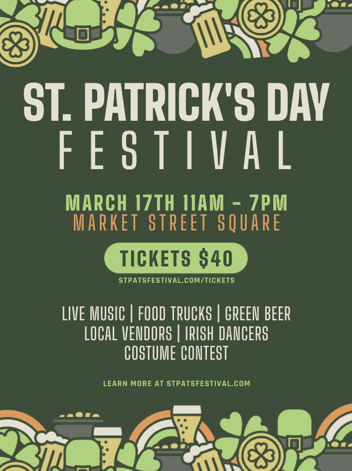
St Patrick's Day festival poster template (start designing)
These are just a sample of the free poster templates you can find over at Studio.
When you design your poster using Studio, you can easily download and save your design in a print-ready format — or send it directly to Sticker Mule for printing in just one click.
With Studio to design your poster, and Sticker Mule to print it, you’ll be able to create a professional-quality poster without the need for expensive software or equipment. Plus, Sticker Mule offers fast turnaround times and worldwide shipping, so you can have your printed poster delivered right to your doorstep in the blink of an eye. (At least metaphorically.)


