The making of our new homepage video
Jeremy Wick द्वारा इस को पोस्ट किया गया
Our home page is the first interaction most visitors and customers have with our brand. Our previous home page video showed the ordering process, but lacked a story that focused on our customers. Here’s a behind-the-scenes look at how we created our new homepage video.
Script
Instead of making a basic “how-to” video, we wanted to make something that was more inspirational and persuasive. To do this, we knew we had to tell a story – one that revolved around our customers. One blessing & curse with our business is that we have all sorts of different customers: big businesses, small businesses, non-profits, hobbyists, do-it-yourselfers, developers, designers... the list goes on. There isn’t just one “target customer” we go after, so we decided to focus our story on three: a startup, a do-it-yourselfer, and a designer.
With our personas selected, we focused on a few key features of Sticker Mule that we wanted to highlight in the script:
Ease of use
- No file restrictions
- Mobile friendly
Proofing
- Online proofs within 4 hours
- Unlimited revisions
Speed
- Quick turnaround
- Free shipping
It was important to highlight the minor differences in how each person used Sticker Mule. For example, if we only showed someone uploading a photo from their phone that might turn away the designer who wants a pixel perfect print. But if we only showed the designer uploading a vector image that might turn away someone who doesn’t have graphic design skills.
After showing the entire ordering process, we focused on how each person used their stickers in real life. Easy ordering and fast shipping are great, but how they plan to use the stickers is the main reason people buy in the first place.
Storyboard
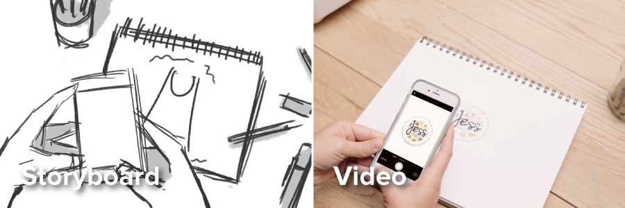
A storyboard is a scene by scene drawing of how the video will look. We created a storyboard to plan the shoot and fix any potential pitfalls before we shot anything. We kept things simple by limiting the video to 4 different locations: Aaron’s office, Jess’ workspace, Brian’s desk, and a location that would tie in all three of them.
Voiceover
We used the same voiceover pro to remain consistent with our other videos. One big advantage of using a voiceover (as opposed to on-camera dialogue), is that we didn’t have to worry about sound once we began filming. This made shooting and editing much easier and faster.
Shooting
We shot the entire video in one day. This required a tight schedule for each location and set call-times for the actors. Luckily, each location was relatively close together, and everyone showed up on-time.
We kept the storyboard on hand as a reference to make sure each shot fit what we had envisioned.
For the final scene, we knew the timing was key. So we played the voiceover through an iPhone, which kept our camera movement and actors all in sync.
Editing
We used a combination of Premiere Pro and After Effects for all the post production work on this video.
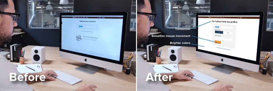
Since the ordering process is a key part of this video, we knew that whatever took place on the screens in the video had to look really good. But shooting a screen isn’t always easy and doesn’t always look as sharp as you would want it to. For this reason, we decided to overlay screencasts on top of the screens shot in the video. For the MacBook and iMac this was relatively easy, but the iPhone took some motion tracking and masking work to have it look realistic.
Instead of using straight-up screen capture footage, we recreated each scene and animated it in After Effects. This made all the movement perfectly smooth, and helped us with the next step: translating.
Translating
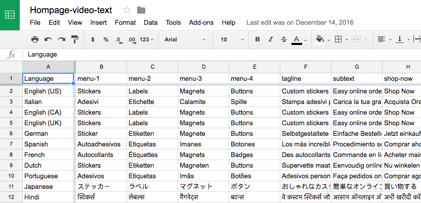
Since the whole video was narrated via a voiceover this made translating very straightforward. However the on-screen scenes needed to be updated to have the localized versions of the site in each language. To make this easy, we used the Templater Rig After Effects plugin from Dataclay.
The Templater plugin allowed us to update each layer of text via a Google Sheet. We only had to animate the screencasts once, and we could easily change languages with a click of a button.
If you’re interested in seeing our homepage video in different languages here are the links. Just make sure you switch back to English (bottom right) when you’re done!
Conclusion
We’re thankful to have 100,000 customers that trust us to print their custom stickers, magnets, and poly mailers. It’s impossible to capture everyone’s unique story, yet we aimed to capture a representation of many stories in one minute and fifteen seconds.
And if you liked this video, you should subscribe to our channel on YouTube.


