We improved mobile navigation
Posted by Jeremy Wick on
At Sticker Mule, we are obsessed with making the best user experience for our customers. And whether you’re on desktop or mobile, we want Sticker Mule to be the easiest place to order custom printing.
Smart phone use continues to grow. In fact, iPhone users represent the largest cohort of users on our site and Android is not too far behind.
That’s why we completely redesigned our mobile navigation to make it easier to browse our products, tools, and more.
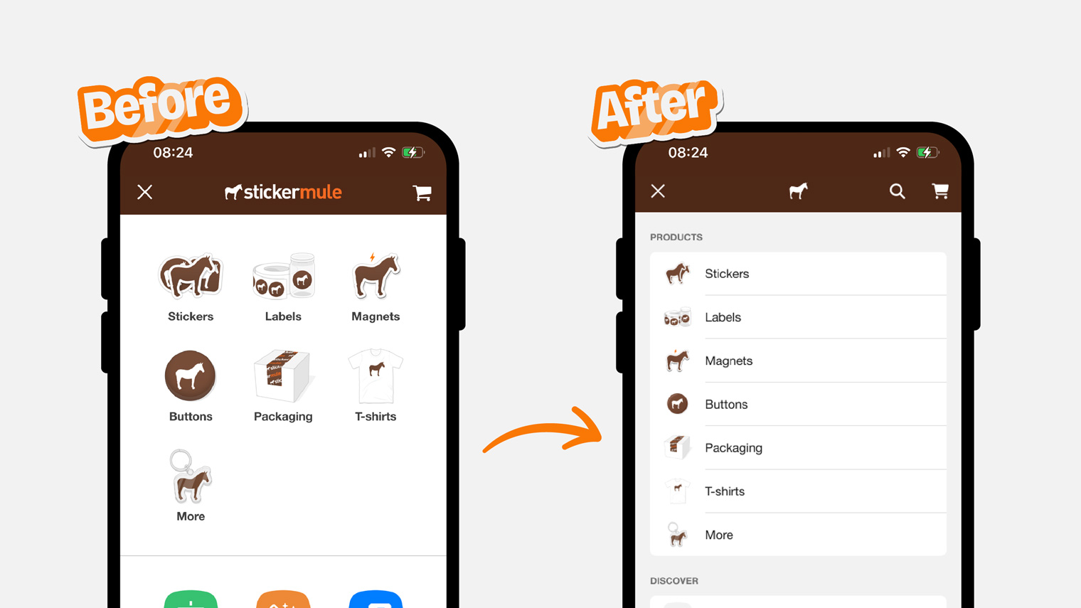
Before
While our old mobile navigation looked good it had some usability issues.
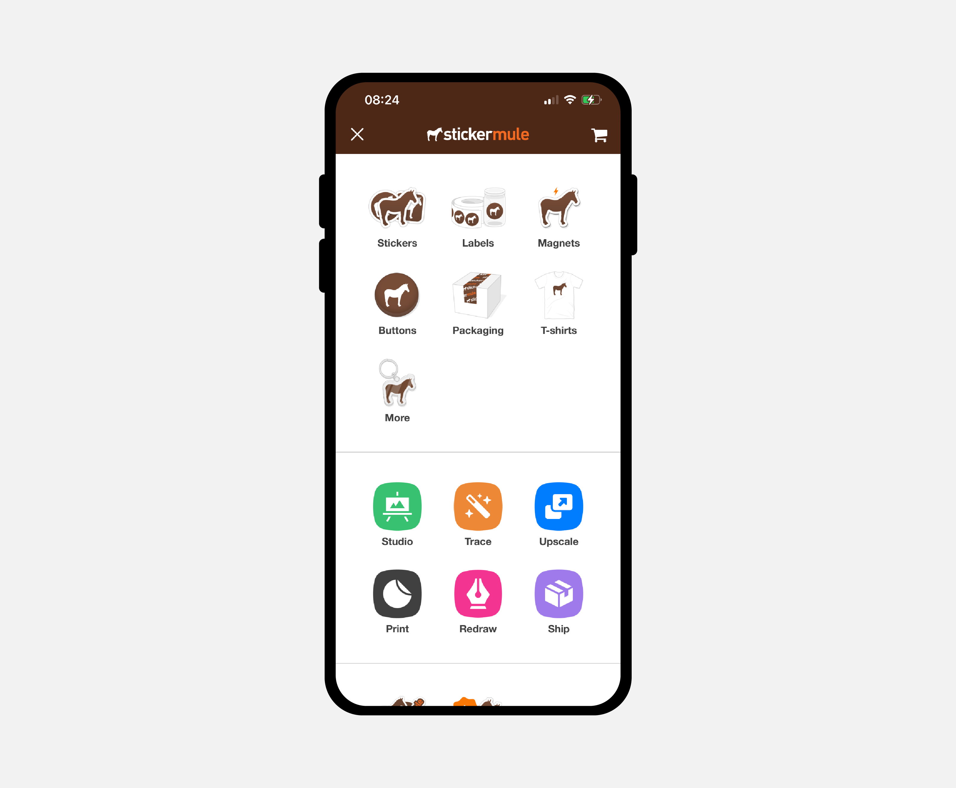
This type of navigation works fine on larger screens, but the small icons aren’t the easiest to tap. And it’s difficult to quickly browse all the options.
After
Our new mobile navigation looks great and works really well.
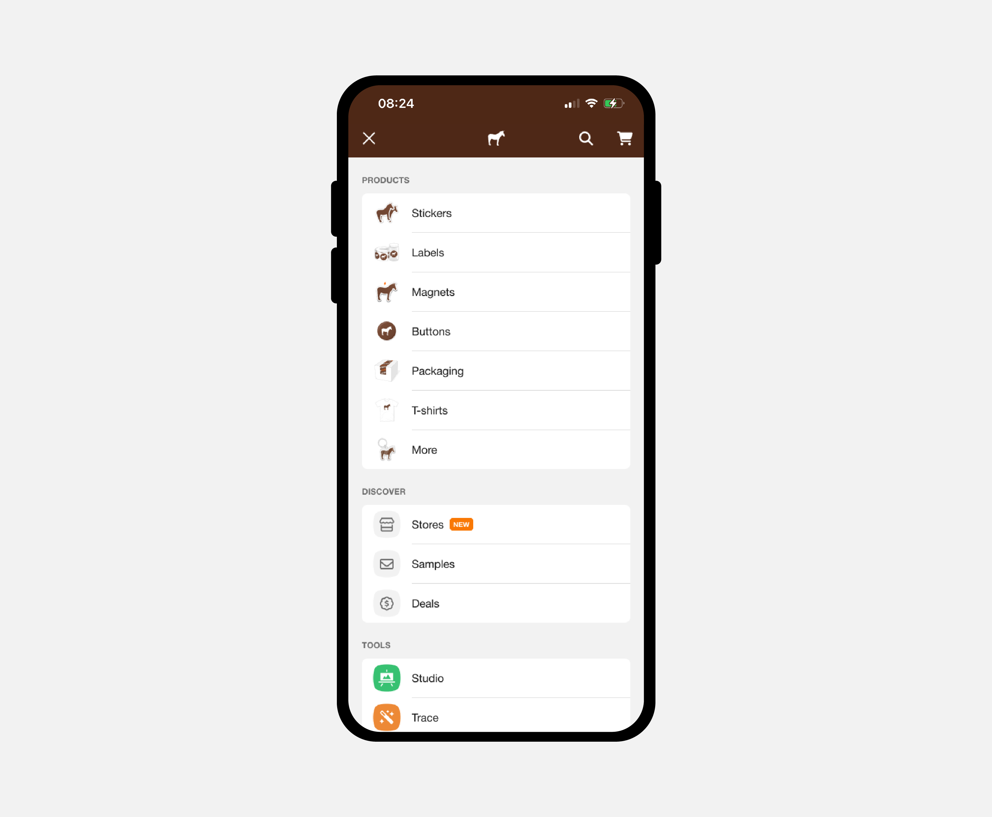
The single column navigation is much easier and natural to swipe scroll with your thumb. And the wider links make each item easier to tap. This layout more closely follows Apple’s Human Interface Guidelines.
We aim to keep making meaningful UX improvements to firmly establish Sticker Mule as the internet’s favorite printer.
Comments